What's new

Writer's Block - C&C

theeph

TPF Noob!
Joined
Apr 5, 2012
Messages
66
Reaction score
9
Location
United States
Can others edit my Photos
Photos NOT OK to edit
I would love to know your thoughts.
Thanks in advance.

$CKnightRhythm2.webp
 
You guys are picking on me. :)
 
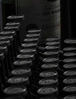
I'm not sure if it's just my untrained eye, but I believe it is slightly underexposed, with too much of it either out of focus or in focus (depending on what you were going for). A shallower depth of field would've lent a lot to it.
 
the cool thing about this photo, was i first u try to look at the keyboard its blurred then it brings you toward the back where u can actually see some letter, then the whiskey, that's when the title writer's block clicks. awesome... idk for me... just... well.. if i didnt know that title of the photo would it convey the same message? would i get to the conclusion that easily?
 
the cool thing about this photo, was i first u try to look at the keyboard its blurred then it brings you toward the back where u can actually see some letter, then the whiskey, that's when the title writer's block clicks. awesome... idk for me... just... well.. if i didnt know that title of the photo would it convey the same message? would i get to the conclusion that easily?

I want the title to bring the meaning out. I like that it built into something for you and even if it doesn't with most I think the picture is still firm. Thanks, a lot, for your response!
 
I'm not sure if it's just my untrained eye, but I believe it is slightly underexposed, with too much of it either out of focus or in focus (depending on what you were going for). A shallower depth of field would've lent a lot to it.

You won't be alone. However, I'm actually rather content with exactly how the focus and exposure came out. Thank you very much for your honest critiques!
 
The 'R' in Irish Whiskey seems sort of randomly lit. Like there's no context for where that light would be coming from. It almost looks like a tiny penlight is coming out of the keyboard. It also seems tilted to the left. I like the exposure given the subject.
 
I like the idea more than the photo itself. Not saying its not a good photo, I just wish there were more elements to the story to convey the emotion of writers block. When looking at the photo it makes me think of a photo taken from behind a person sitting in a chair with messy hair, head down on the work table, crumpled up paper all over the place, a messy stack of papers, some paper in the type writer that's all crossed out, an empty cup and one with some whisky in it, a tipped over bottle of rum and the bottle of whiskey. Maybe a little more warn colors from a table lamp or what have you.

Maybe what I am trying to get at, is that it's missing the human element for a title such as that.

For a critique specific to the picture, my biggest concerns or thoughts; the photo could be tilted to allow the bottle to be vertical. It's slightly tilted.

Feels a bit too cold for me to. I'd try to warm up the colors a little. Not a whole lot just some.

I do like the DoF in that it draws your eyes from the front to the rear where the whisky bottle is.

Just some ideas :)
 
The 'R' in Irish Whiskey seems sort of randomly lit. Like there's no context for where that light would be coming from. It almost looks like a tiny penlight is coming out of the keyboard. It also seems tilted to the left. I like the exposure given the subject.

You know, I didnt really notice the R before and now it's all I see. :P
 
I like the idea more than the photo itself. Not saying its not a good photo, I just wish there were more elements to the story to convey the emotion of writers block. When looking at the photo it makes me think of a photo taken from behind a person sitting in a chair with messy hair, head down on the work table, crumpled up paper all over the place, a messy stack of papers, some paper in the type writer that's all crossed out, an empty cup and one with some whisky in it, a tipped over bottle of rum and the bottle of whiskey. Maybe a little more warn colors from a table lamp or what have you.

Maybe what I am trying to get at, is that it's missing the human element for a title such as that.

For a critique specific to the picture, my biggest concerns or thoughts; the photo could be tilted to allow the bottle to be vertical. It's slightly tilted.

Feels a bit too cold for me to. I'd try to warm up the colors a little. Not a whole lot just some.

I do like the DoF in that it draws your eyes from the front to the rear where the whisky bottle is.

Just some ideas :)

Thanks so much for your feedback.

I like that it's missing all of that, because it made you come up with that little story. I don't want to tell the whole thing. The viewer is the human element. I'm sure it's not some amazing piece of art for most, but it's probably the best picture i've ever taken. I'm very proud and the feedback I've received is wonderful, thanks, again.
 
Excellent way to caption it....
I would like to have a better view of letters because they are the subject of the image...probably looking from a bit high point of view.... you could have focused on this end, middle or the other end of the key board making other fonts seen blurred... also a bit more brightening would help, i feel
PS: bottle helps to construe a story

Regards :D
 

Create an account or login to comment

You must be a member in order to leave a comment

Create account

Create an account on our community. It's easy!

Log in

Already have an account? Log in here.

Back
Top Bottom