What's new

Your views

Jmain7, Here is what I see on these.

1) looks a little soft to me (focus not tack sharp). It looks like you may be using the on camera flash. I like the pose and composition of this one.
2) Again the flash looks to me like on camera but it's good composition.
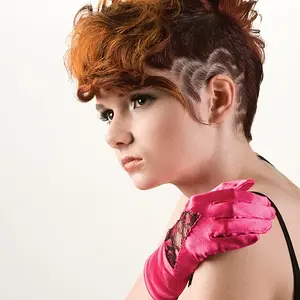
3) I only have two nitpicky things about this one. The first is the cropping of the fingers. Watch small things like this. The second is the selective color, I don't think it works in this case. I do like this photo however, but I think it would be better in all b&w.
4) Looks again like soft focus with on camera flash.
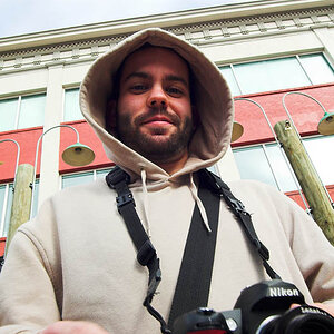
5) To me this is the best except for the on camera flash that looks to be creating a couple of hot spots on his face. I like the smile on this one.
 
Jmain7, I'd recommend you do some research and reading on composition to start with - I'm sure some of the other folks will have a little more in depth tips for you on lighting, etc - but really I think the foundation of a really good photograph lies in how the image is composed. I'd start with just a simple google search, you'll be able to find a ton of helpful information, tutorials and guides on photographic composition.

Why are you suggesting composition books and research? I'm not saying that the information isn't a good idea in general but the photos posted here seem to be composed pretty well.
 
Thanks guys.we are all forever learning and I respect all the feedback given.
I was using the hotshoe flash.
Whenever I search online for flashes theres just too many to choose from.
Any recommendations on good priced flashes and also lighting kits,sort of the quick easy mobile collapsable type not the rod insert type.
 
Why are you suggesting composition books and research? I'm not saying that the information isn't a good idea in general but the photos posted here seem to be composed pretty well.
Strongly disagree.

#1 = person sitting perfectly square to the camera looking directly into the camera centered. It is better than #2 and shows some thought, but is not very interesting or dynamic.
#2 = Really distracting signs in the back drawing your eye away from the subject, camera is below them for some reason, classic facebook-y "lean in BFFs forever!" pose, random cup of liquid that has nothing to do with the image, distracting rainbow purse strap. I really don't think this was composed at all.
 
Why are you suggesting composition books and research? I'm not saying that the information isn't a good idea in general but the photos posted here seem to be composed pretty well.
Strongly disagree.

#1 = person sitting perfectly square to the camera looking directly into the camera centered. It is better than #2 and shows some thought, but is not very interesting or dynamic.
#2 = Really distracting signs in the back drawing your eye away from the subject, camera is below them for some reason, classic facebook-y "lean in BFFs forever!" pose, random cup of liquid that has nothing to do with the image, distracting rainbow purse strap. I really don't think this was composed at all.

I would agree with you on #2. My comment about composition was more focused on the set of 5 that he posted last, not those first two.
 
I would strongly suggest turning the camera to vertical orientation on close-range shots like the majority you have shown us, so as to include the top of the subject's head, and also to exclude large expanses of uninteresting background. Now, in the case of the two women in the club, at the "mouldybeats" event, the inclusion of the "mouldybeats" signage on the wall makes sense, and ADDS context, it places the club picture at a SPECIFIC event. On some of the kid pictures, the large expanse of the distracting or just plain walls is just useless inclusion, at the expense of proper space around the subject.

It's okay to crop tightly, and even crop off the top of the head of a person--but NOT when it's supposed to be a head-and-shoulders composition. If the composition is a CLOSE-UP look, yes, you can easily crop into the head and have an effective picture, but the boy in the yellow backdrop image...that's a bad composition. The use of the frame is poor. This is where the suggestion to study composition is coming from. Many beginners frame everything "wide", but when the top of the head is cropped off on shots like these, it often looks bad to those with sophisticated visual sensibilities.
 
Those new ones you posted are all definitely improvements regarding vignetting.
1) They all still have cookie cutter composition with kid in middle of frame usually just looking right at you. You need to vary that a lot. (The composition books)
2) They all have deer in headlights lighting, surely because, as you mentioned, you were using popup flash. Popup flash is evil. (Lighting books).

Seriously, just order a couple of books. It is infinitely more efficient to start there than to use forums for detailing everything about composition and lighting.
http://www.amazon.com/Bryan-Petersons-Understanding-Composition-Field/dp/0770433073 I like this guy. He doesn't have any straightforward general beginner lighting books though AFAIK. But there are many other options.
 
Thank you all for your Knowledge. :)
 

Create an account or login to comment

You must be a member in order to leave a comment

Create account

Create an account on our community. It's easy!

Log in

Already have an account? Log in here.

Back
Top Bottom