1) Seems a bit oversaturated
2) The composition could use some work. Since you can't see any sky and can barely see any leaves, there is no sense of scale or anchoring. And there aren't many clear shapes to look at.
I use as a rule of thumb "imagine what the image would look like if you were squinting your eyes a bit and it was the size of your thumbnail. At that size and blurriness, would the shapes still be compelling enough to make you want to look closer?"
This image at thumbnail size would just be an almost uniform red brick of color, and would not make me want to click closer.
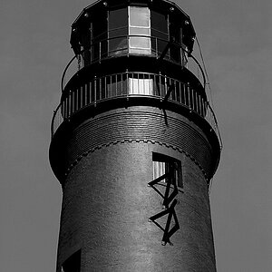
As an example of one that would, this is my favorite composition of this landmark that I see from google images:

The colors in this are weird, but I'm just talking about the composition. The shapes are compelling and interesting, even at 50x50 pixels. It makes me want to zoom in, and then when I do, I can also appreciate the small shadow detail and the waterfall, etc. You have interesting small detail and texture, but you have to get the viewer close enough first to see it.