
bowronfam3
TPF Noob!
- Joined
- Mar 7, 2006
- Messages
- 179
- Reaction score
- 0
Hey guys! I took some shots of my Dept. 56 Houses. Not a ton of editing done here...I love my new camera!!  Let me know what you think!
*Edited to add that these seem really blurry on here for some reason...maybe ImageShack is the problem, that's where they're being hosted at. Anyway, the originals aren't quite so blurry, and not as noisy either. Still, let me know what you think!
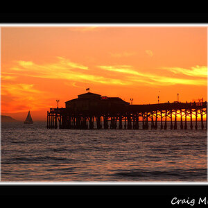
1

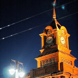
2

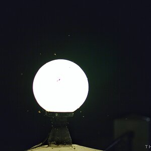
3

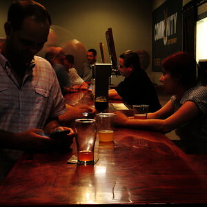
4

Let me know what you think!*Edited to add that these seem really blurry on here for some reason...maybe ImageShack is the problem, that's where they're being hosted at. Anyway, the originals aren't quite so blurry, and not as noisy either. Still, let me know what you think!
1
2
3
4


![[No title]](/data/xfmg/thumbnail/32/32150-7445fc014b4b484b24ba067189aa45b6.jpg?1619735233)