
Hi guys, I'm a noob as you will probably be able to tell by my photographs, but I was wondering if you guys could give me any tips on my portrait shots, as they are my favorite shots to take. Any help is much appreciated. Thanks!
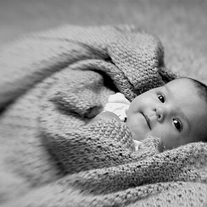
1.

2.

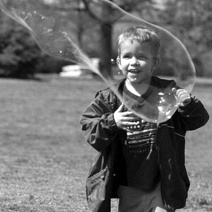
3.

4. I did a small amount of post processing to give this one an older look.

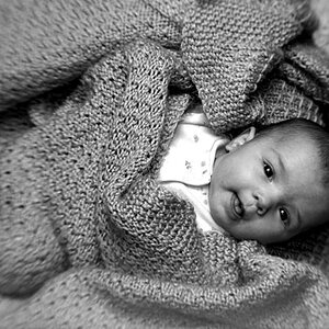
5.

5. edited. I took the power cord out. still have a lot to learn about editing. to the left side of her head you can still see some blurriness. I had a hard time cloning the carpet and then blending it in with the rest of it.

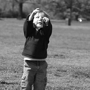
6.

7.

I'm shooting with a Nikon D40 and the 18-55mm kit lens. I'm currently absent of photoshop so I do very little post processing.
Thanks in advance everyone.
1.
2.
3.
4. I did a small amount of post processing to give this one an older look.
5.
5. edited. I took the power cord out. still have a lot to learn about editing. to the left side of her head you can still see some blurriness. I had a hard time cloning the carpet and then blending it in with the rest of it.
6.
7.
I'm shooting with a Nikon D40 and the 18-55mm kit lens. I'm currently absent of photoshop so I do very little post processing.
Thanks in advance everyone.
Last edited:

")


![[No title]](/data/xfmg/thumbnail/39/39292-4169a355b794ae9735845c4ad45d06ff.jpg?1619738958)


![[No title]](/data/xfmg/thumbnail/42/42350-49b17d39599ec1d51c6d801ea651d3af.jpg?1619740148)
