Navigation
Install the app
How to install the app on iOS
Follow along with the video below to see how to install our site as a web app on your home screen.

Note: This feature currently requires accessing the site using the built-in Safari browser.
More options
You are using an out of date browser. It may not display this or other websites correctly.
You should upgrade or use an alternative browser.
You should upgrade or use an alternative browser.
1st Studio Shoot
- Thread starter tank121
- Start date
ABJayce
TPF Noob!
- Joined
- Feb 14, 2013
- Messages
- 51
- Reaction score
- 10
- Location
- Washington, DC
- Website
- www.artsbyjaycephotography.com
- Can others edit my Photos
- Photos OK to edit
Get creative, don't put your first studio shoot on some pedestal or something, go in there and own it. Put a flash behind the subjects head and reflect light back into her eyes and face for some nice rim and sparkling blue eyes. Or use a 1 light set up for some depth, shadows are your friend.....just treat them right. Just make sure you light up those eyes
- Joined
- Jan 16, 2013
- Messages
- 20
- Reaction score
- 7
- Location
- Blackfalds, Alberta
- Can others edit my Photos
- Photos OK to edit
Please post some of your results. I, too, shoot with a D5100 and would like to see how portraits work out.
Good luck!
Good luck!
Shoot done, must admit I was nervous. Didn't help when the tethering cable didn't fit in my D5100 so had to use the college's D90 and put my Sigma 17-50 2.8 on it. My fellow student who was manning the reflector was a kept wanting to try new things! I think i got a few good shots. In the main using one softbox and a reflector. Photos to follow, should I post both before and after Lightroom?
Derrel
Mr. Rain Cloud
- Joined
- Jul 23, 2009
- Messages
- 48,225
- Reaction score
- 18,941
- Location
- USA
- Website
- www.pbase.com
- Can others edit my Photos
- Photos OK to edit
It might be interesting to see the before and the after; not many people do that, but it is instructive to actually get to SEE the "before" appearance and to compare it against the "after" and its overall look and feel.
Gavjenks
TPF Noob!
- Joined
- May 9, 2013
- Messages
- 2,976
- Reaction score
- 588
- Location
- Iowa City, IA
- Can others edit my Photos
- Photos OK to edit
There are lots of different light positions based on the look you want. This website shows an excellent overview of the most basic and traditional ones, with clear examples of lighting diagrams and outcomes:
6 Portrait Lighting Patterns Every Photographer Should Know
Notice that all of their diagrams show only one main light (in one case two I think?). In actual practice if you need to control the relative strength of TWO lights. The diagrams show you the positions of the KEY light - the stronger one. The dark part of the face is lit by the fill light.
"Fill light" isn't necessarily a literal object. It can simply be whatever spare light is bouncing around the room or off of trees from the key light, in the case of natural lighting only. Or it can be a literal light. In either case, you can control the ratio of the two, and need to. The RATIO is what matters most. Absolute light matters less, because you can usually make everything lighter or darker with your camera exposure.
Natural light, let's say a window: Here you control fill versus key light ratio by keeping the same angle, but moving the subject closer or further from the window. Closer = stronger key light compared to bounced light from the room = stronger ratio. Further from the window = light and dark parts of the face are nearer one another = weaker ratio. Or of course if you have a reflector, the distance and position of that controls ratio too.
Artificial light, like strobes: You can also move them relative to one another. Or you can vary their EV strengths. Either option is good in different situations (just like aperture vs. shutter speed have their own tradeoffs). Distance changes how soft the light is, so you need to beware of that if using distance to vary your lighting ratio. Whereas power carries the risk of different color casts from your two strobes (if you have cheaper ones), as color changes sometimes based on power flow.
The core of your lighting is defined more or less by:
1) The pattern / angles of your key vs. fill (In the above link examples, butterfly vs. split vs. rembrandt are different patterns)
2) The ratio of the key vs. fill strengths (relevant to any pattern)
3) The quality of each of the two lights (mostly how soft it is, and in some cases how narrow it is if the light is narrow enough to only light part of your subject. Also color)
Obviously it gets more complicated if you have like 5 lights, but that's the basics.
Last edited:
JoeW
Been spending a lot of time on here!
- Joined
- Dec 17, 2013
- Messages
- 2,102
- Reaction score
- 1,035
- Location
- Northern Virginia
- Website
- 500px.com
- Can others edit my Photos
- Photos OK to edit
Next Monday I'll be carrying out my first studio shoot using my friends sister as the model, mainly head and shoulders shots. I will be using the college studio with two soft boxes and from my experience last night they will generally positioned at 45 degrees to the subject.
There is a choice of three 3 different colour back drops blue, black and white. The model has blonde natural hair so what would be the best combination of colour in the top she'll be wearing and the back drop?
I'll be using my D5100 and Sigma 17-50 2.8, I intend to fill the frame with my shots and use an aperture in the range 5.6-11.
My shutter speed with be 1/125 in sync the lighting.
My series of shots will include -
Model looking at the camera
" " at me
" " off camera focusing on an object in the room
At the edge of the shot looking into the space.
With this combination will i be able to just capture pics of just the eyes or lips?
Any other suggestions for poses etc would be greatly appreciated. Any good websites with examples?
I've got a couple of comments/tips:
1. You ask about "with this combination will I be able to just capture pics of just the eyes or lips?"...I assume you mean DoF shots so we see her face but the lips or eyes are in focus and then the DoF is narrow enough that facial flaws or other stuff starts to blur. Not at f2.8. You'd really need something more like f1.6 for the lips or f1.8 for just eyes.
2. If you've got black, blue, and white backdrops, depending upon how you light them if she wears blue or black she may just disappear into the backdrop.
3. As for color combinations complementing the hair, frankly I think that's more about the quality of the light.
4. As for the type of top, a lot depends upon skin condition (strong tan lines? acne scars on the shoulders?) and if she has big biceps or "granny arms". Off-the shoulder can look great but you need to watch for bra strap marks on the skin (takes some time for those to fade). I think the most important advice for clothing is a tip I got from my sister-in-law: tell her to wear something that she thinks she looks good in (as long as it doesn't have lots of tiny patterns in it). If she feels like her outfit fits well and looks good on her, she'll pose better and look more confident (rather than look stiff and uncomfortable).
5. A good tip for any inexperienced model...give 'em something to do with their hands. A champagne flute. A rose. A pair of sunglasses to hold.
Since this setup, model and type of shoot are new to you, my advice is to bring your laptop. Shoot a couple of test shoots, load 'em up on to your laptop and the two of you take a quick look. Then make decisions on tops, backdrops, and lighting modification.
Okay--reading through the second page of the thread I just discovered the shoot has already happened. Well, feel free to react to this in terms of what you think might have helped or not worked.
Gavjenks
TPF Noob!
- Joined
- May 9, 2013
- Messages
- 2,976
- Reaction score
- 588
- Location
- Iowa City, IA
- Can others edit my Photos
- Photos OK to edit
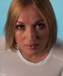
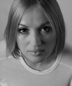
I edited these pretty majorly, which is NOT what you should do, but I think they better approximate what some better choices in studio might have looked like, which I outline below alongside the comments about edits.
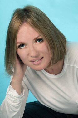
Here's my edit of the first one:
and the second
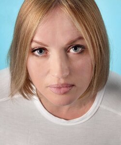
Things I did:
1) Severely underexposed originals. Had to brighten both by several stops probably. Looks fine in a thumbnail, but printed, these would have issues, because brightening too much loses data and causes posterization. Expose more in-camera.
2) The face was comparatively dark with the rest, which had to be reversed, so selective lightening to faces only (this should be done on scene with lighting though)
3) The detail on her face was really harsh and unflattering, probably the light was too far off to one side. Doing that highlights texture, which most women don't want you to do. For men it's more often good, but still generally only if you want a rough and tumble sort of look, not for a glamorous well groomed pretty boy. I did a lot of clone stamping at 50% opacity to smooth out the texture a bit again. If you must edit it in PP, 50% clone is a great tool, because it majorly softens, still looks natural, and doesn't insult the model, because you can still see all the wrinkles and features, so it doesn't look like you were editing things out.
3) The lighting was harsh - a single point source almost, leading to harsh lined and edged shadows. You need a diffuser, like an umbrella or softbox on you light. I clone stamped out some of the worst areas.
4) The white balance was really off on both, in different ways. I couldn't really get them to match up, though I tried. Shooting in manual mode in a studio helps maintain coloration consistency across shots, because you get it right once, and the lighting situation isn't changing, then you just don't touch anything. And if you want to adjust color later, you can do it as a batch process equally on everything. Thus all the photos would look the same color and lighting, unlike here.
5) The side lighting also highlighted every larger scale bump on her face and made some weird nose shadows, etc., which I either cloned or used dodge and burn tools to even out a bit.
6) The wardrobe here is pretty terrible. Flimsy white t-shirt doesn't look too classy. It's also transparent and shows up as pink from her skin underneath, which I had to fix in the second one by selecting the shirt and desaturating and brightening.
7) I brightened and sharpened and contrasted the eyes more, which is not really an in-studio thing, I'd always do that in PP.
8) Recropped a bit or cloned out creases and slivers of arm, but could only do so much in this regard. Pay attention to your edges and dont' cut limbs down their length or chop off hands if you can help it, etc., or have random bits of sleeve showing.
Things I couldn't edit:
9) Poses are a bit wanting. The second one looks mugshot-y, straight on like that rarely looks good unless you have some really really well done and probably pretty dramatic lighting. Normally I'd only consider straight on if I was either doing a comparison before-after makeup shot or something, or if I planned on making half her face in total shadow (mysterious carmen san diego sort of thing, ideally with floppy hat lol).
10) She looks kind of pissed off in the second one. Don't forget to tell your model how good they look and keep chatting and keep spirits up. Project confidence even if you're panicking, and you should probably tell them to smile more until you get a better hang of poses and lighting, because mysterious/sultry/whatever expressions are harder to pull off in a consistent looking way than a smile is. The first is better, but still looks uncomfortable to me, I dunno.
And B&W versions which I think look better together due to the coloration consistency:
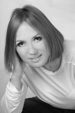

(Just converted to B&W, cranked up reds and yellows a bit, and more dodge and burn due to different things emphasized in B&W)
Still some issues I'm seeing after coming back awhile later. Like the left one is dark on bottom of face light on top, due to my struggles with massively lightening and mucking around with it. Not gonna go back and fix it -- it is a good example of why you don't want to muck around with stuff in PP compared to in the studio when it comes to light.
Here's my edit of the first one:

and the second

Things I did:
1) Severely underexposed originals. Had to brighten both by several stops probably. Looks fine in a thumbnail, but printed, these would have issues, because brightening too much loses data and causes posterization. Expose more in-camera.
2) The face was comparatively dark with the rest, which had to be reversed, so selective lightening to faces only (this should be done on scene with lighting though)
3) The detail on her face was really harsh and unflattering, probably the light was too far off to one side. Doing that highlights texture, which most women don't want you to do. For men it's more often good, but still generally only if you want a rough and tumble sort of look, not for a glamorous well groomed pretty boy. I did a lot of clone stamping at 50% opacity to smooth out the texture a bit again. If you must edit it in PP, 50% clone is a great tool, because it majorly softens, still looks natural, and doesn't insult the model, because you can still see all the wrinkles and features, so it doesn't look like you were editing things out.
3) The lighting was harsh - a single point source almost, leading to harsh lined and edged shadows. You need a diffuser, like an umbrella or softbox on you light. I clone stamped out some of the worst areas.
4) The white balance was really off on both, in different ways. I couldn't really get them to match up, though I tried. Shooting in manual mode in a studio helps maintain coloration consistency across shots, because you get it right once, and the lighting situation isn't changing, then you just don't touch anything. And if you want to adjust color later, you can do it as a batch process equally on everything. Thus all the photos would look the same color and lighting, unlike here.
5) The side lighting also highlighted every larger scale bump on her face and made some weird nose shadows, etc., which I either cloned or used dodge and burn tools to even out a bit.
6) The wardrobe here is pretty terrible. Flimsy white t-shirt doesn't look too classy. It's also transparent and shows up as pink from her skin underneath, which I had to fix in the second one by selecting the shirt and desaturating and brightening.
7) I brightened and sharpened and contrasted the eyes more, which is not really an in-studio thing, I'd always do that in PP.
8) Recropped a bit or cloned out creases and slivers of arm, but could only do so much in this regard. Pay attention to your edges and dont' cut limbs down their length or chop off hands if you can help it, etc., or have random bits of sleeve showing.
Things I couldn't edit:
9) Poses are a bit wanting. The second one looks mugshot-y, straight on like that rarely looks good unless you have some really really well done and probably pretty dramatic lighting. Normally I'd only consider straight on if I was either doing a comparison before-after makeup shot or something, or if I planned on making half her face in total shadow (mysterious carmen san diego sort of thing, ideally with floppy hat lol).
10) She looks kind of pissed off in the second one. Don't forget to tell your model how good they look and keep chatting and keep spirits up. Project confidence even if you're panicking, and you should probably tell them to smile more until you get a better hang of poses and lighting, because mysterious/sultry/whatever expressions are harder to pull off in a consistent looking way than a smile is. The first is better, but still looks uncomfortable to me, I dunno.
And B&W versions which I think look better together due to the coloration consistency:


(Just converted to B&W, cranked up reds and yellows a bit, and more dodge and burn due to different things emphasized in B&W)
Still some issues I'm seeing after coming back awhile later. Like the left one is dark on bottom of face light on top, due to my struggles with massively lightening and mucking around with it. Not gonna go back and fix it -- it is a good example of why you don't want to muck around with stuff in PP compared to in the studio when it comes to light.
Last edited:
Gavjenks
TPF Noob!
- Joined
- May 9, 2013
- Messages
- 2,976
- Reaction score
- 588
- Location
- Iowa City, IA
- Can others edit my Photos
- Photos OK to edit
Can you diagram as accurately as possible what your setup was with to-scale angles if you can?The majority of the shots including the one above I'm sure, were using one softbox and reflector.
It looks like the first one was just barely off to your left almost on top of the camera, like maybe 15-20 degrees off, so I'm not sure how a reflector would have really been in a position to accomplish very much there. Unless it was filling from below, which it doesn't look like.
The second one looks like the main light was way off to the left, making her face almost half/half lit dark, and a reflector positioned opposite would have been doing something, but it doesn't look like it was contributing much.
Similar threads
- Replies
- 8
- Views
- 242
- Replies
- 0
- Views
- 320


![[No title]](/data/xfmg/thumbnail/37/37518-fb05b52482bd05e84fb73316ba1a9c8f.jpg?1619738128)
![[No title]](/data/xfmg/thumbnail/33/33422-d1097b04586502aba932c8d5409d8026.jpg?1619735961)
![[No title]](/data/xfmg/thumbnail/35/35268-34a315519597f60516d59124092e9bc2.jpg?1619736971)
