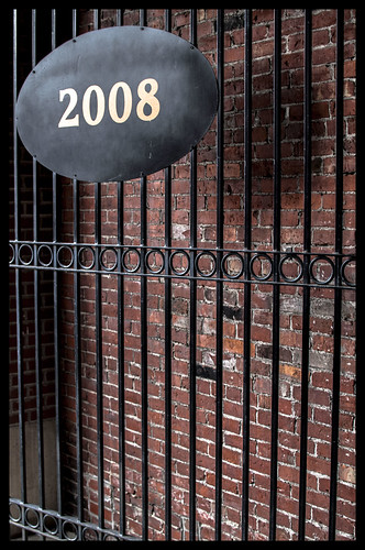
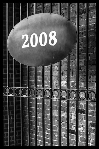
I like the first version. The part of the frame where you placed the oval (high above, with lots of space at the bottom) makes me think of the oval as a zeppelin. Plus, the way the light hits the oval (or maybe it's just the texture of the oval) gives the oval a 3D feel. I wouldn't crop version 1 at all. Love the shadow, which is kinda lost in version 2. The B&W version might work better with a tad extra contrast, but regardless I like the original crop better.




![[No title]](/data/xfmg/thumbnail/41/41935-851da2b46dc9cbb829c8c42b2aa84873.jpg?1734176290)