Sarmad
No longer a newbie, moving up!
- Joined
- Aug 4, 2012
- Messages
- 420
- Reaction score
- 156
- Location
- Mansehra, Pakistan
- Website
- 500px.com
- Can others edit my Photos
- Photos OK to edit
Hi,
I have been having dilemmas about different photos while I edit them, some edits bring out a certain mood in them. Like I am editing a photo and I realize that in this particular situation dragging down into negative clarity (Lightroom) will make the photo look more dreamy, while at certain times I'd see that crushing the matte black brings a analogue and melancholic vibe to it. Please vote about which photo you like so I can have an idea of what other people like. Also if possible, take some time out and critique the photos so I can become a better photographer
EDIT: For some reason I am not able to enlarge the hyperlinks I posted here, please bear to click on the links to view the photographs.
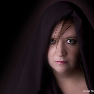
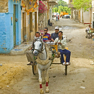
Photo 1:

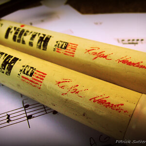
Photo 2:

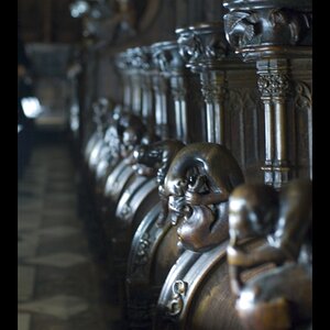
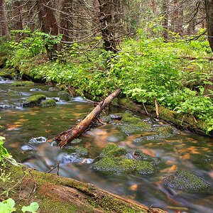
Photo 3:

I have been having dilemmas about different photos while I edit them, some edits bring out a certain mood in them. Like I am editing a photo and I realize that in this particular situation dragging down into negative clarity (Lightroom) will make the photo look more dreamy, while at certain times I'd see that crushing the matte black brings a analogue and melancholic vibe to it. Please vote about which photo you like so I can have an idea of what other people like. Also if possible, take some time out and critique the photos so I can become a better photographer
EDIT: For some reason I am not able to enlarge the hyperlinks I posted here, please bear to click on the links to view the photographs.
Photo 1:
Photo 2:
Photo 3:
Last edited:
") Welcome back!
Welcome back!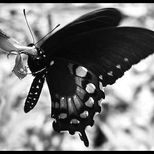


![[No title]](/data/xfmg/thumbnail/31/31011-439c1242fe08cf6b54f32bf06523a567.jpg?1619734567)