52 week photo project

Here's my submission for "Growth."

One thing I'm learning... I need to improve my skills at working with kids, lol. I once again had a much better idea than this, but couldn't get the multiple kids involved to all look good at the same time :)


Please C&C!

WhiskeyTango

I really like the concept but I also agree with o hey tyler. Definitely on the right track though.

I'll file that in the "I got overly artistic," category... lol

I intentionally re-toned this image. Actually, this is my first attempt at selective coloring. I painted the whole image with a B&W brush and then selectively removed it from the orange iPod. I probably should have stuck with the original.

I appreciate the feedback!

WhiskeyTango
 
I intentionally re-toned this image. Actually, this is my first attempt at selective coloring. I painted the whole image with a B&W brush and then selectively removed it from the orange iPod. I probably should have stuck with the original.

Could I ask what program and settings you used for the B&W Brush? It just doesn't explain why the brushed aluminum surfaces were purple tinged... I reckon they'd look like normal iProducts if that were the case, because their finish is essentially a shade of grey.

I'm just curious where the purple came into play, that's all. If there's some underlying cause that you may not be aware of perhaps, or if it was indeed intentional to tone them purple.
 
Here is my take on growth... for now ;)

I tried to make a semi-antique look as I have limited access to lighting props which make it harder to achieve a good photo. Secondly, the growth comes into play with the different maturity levels of each flower.

6758626013_e8ff1ef487_z.jpg
[/URL] _MG_0825 by lee.demers, on Flickr[/IMG]

On a side note. I really wanted to avoid using flowers or plants in this challenge but, I've been working long days and haven't had the chance to even attempt the concept I'm going for. So I'll be revisiting this one at a later date.

CC welcome ;)
 
I intentionally re-toned this image. Actually, this is my first attempt at selective coloring. I painted the whole image with a B&W brush and then selectively removed it from the orange iPod. I probably should have stuck with the original.

Could I ask what program and settings you used for the B&W Brush? It just doesn't explain why the brushed aluminum surfaces were purple tinged... I reckon they'd look like normal iProducts if that were the case, because their finish is essentially a shade of grey.

I'm just curious where the purple came into play, that's all. If there's some underlying cause that you may not be aware of perhaps, or if it was indeed intentional to tone them purple.

All of my editing was done in Lightroom 3. Going back and looking at the develop history, I just realized that some earlier split toning I intended to remove got left in... :( That's where the purple is coming from.

For reference' sake, here's the un-retouched original:

 
Last edited:
And that one is spot on! Nice. :)
 
Hmm... I modified my original to take the history back to where it was before the split toning... It's showing up on Smugmug, but still looks purple here... Probably browsher cache.
 
Kaymarie said:
What is RAW? Sorry still a noob :)
What setting do you change the ISO under? I have been trying to figure it out on my camera but I'm not sure if I'm just not finding it or if in fact I cant adjust it.

By best explanation is RAW a photo format that lets you do an initial edit to your photo without distorting the integrity of your photo. Any edits after may take away from the quality. That's the best I can explain it.

Think of a RAW file as a digital negative, and a .jpg, .gif, .tif, etc., as a digital print. The negative, or RAW, gives you everything the camera captured. The print just gives you what came out of the final process. RAW gives you the ability to control everything right from the git-go.
 
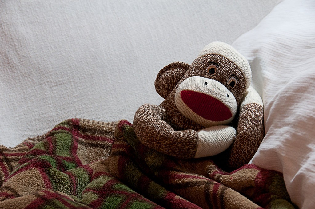
I'll be out of town for a few days so I thought I'd post my "sleep" photo!

Keep in mind that I have a lofted twin size bed, a futon and a love seat in my room; not a lot of possibilities to take a picture of for sleep...
6753706039_4fbe6a4806_b.jpg


I couldn't decide which I liked better, so I'm posting both!
6753705895_38bbc61781_b.jpg
 
jmtonkin said:
I'll be out of town for a few days so I thought I'd post my "sleep" photo!

Keep in mind that I have a lofted twin size bed, a futon and a love seat in my room; not a lot of possibilities to take a picture of for sleep...

I couldn't decide which I liked better, so I'm posting both!

Creepy... He sleeps with his eyes open lol.
" I can see you"
 
I like the 2nd one best. The first one seems a little dark. I'll try to restrain myself from posting my "sleep" photo until tomorrow though since I don't have an excuse not to wait. :)
 
I agree, the first does seem dark...What I don't understand is, when I am working on them in Photoshop and/or Lightroom, they look fine. As soon as I upload them to flickr, they look much darker. Does anyone know why that would be?
 

Most reactions

Back
Top