nateridesbikes
TPF Noob!
- Joined
- Jul 28, 2011
- Messages
- 12
- Reaction score
- 3
- Location
- West Des Moines IA
- Can others edit my Photos
- Photos NOT OK to edit
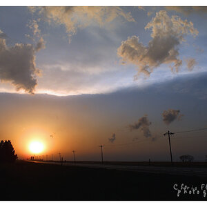
 Untitled by nateridesbikes, on Flickr
 Katie Rae by nateridesbikes, on Flickr
 Katie Rae by nateridesbikes, on Flickr
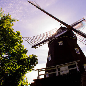
![[No title]](/data/xfmg/thumbnail/32/32006-4103e122cb8d7b8d8e41a423124446b7.jpg?1619735151)
![[No title]](/data/xfmg/thumbnail/32/32004-4455324f0b4b5cc318dd35877147ac47.jpg?1619735148)