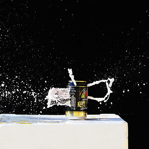
Ballistics
Been spending a lot of time on here!
- Joined
- Jun 5, 2011
- Messages
- 3,781
- Reaction score
- 633
Follow along with the video below to see how to install our site as a web app on your home screen.

Note: This feature currently requires accessing the site using the built-in Safari browser.
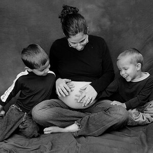
lighting is great, the posing is great
processing feels a bit too dark and greyish but that might be my screen.
might also look better with warmer tones
Overall, I like this. I can see the blue tone working in certain circumstances. A couple of minor nits: I think his body is turned just a bit too far to the right, and his pocket square is causing a bit of a wrinkle in the fabric of the suit.
I think I would crop the sides to make the aspect ratio less-square, and more tall and narrower.
I think I would crop the sides to make the aspect ratio less-square, and more tall and narrower.
This is a 4:5 crop. So you're saying 2:3?
The choice here was to mimic a chain of command portrait which are historically 8x10 photos. I do see what you are saying about the tighter crop though. I typically like to shoot tight.
 said it would look better with a gray backdrop; I did a one-click, eyedropper sample white balance in Lightroom, clicking on the man's shirt collar. That white balance accomplished both warmer tones, and a gray background. I dunno...color can be done a lot of ways these days. If you like it one way, then stick with the way you like it.
For those of you who are feeling that the photo is too cool, here's a color grade on the other end of the spectrum.
Summer evening.
I highly prefer the blue color grade because of the overall mood it produces. If straying away from dead center white balance is wrong, I don't want to be right.

![[No title]](/data/xfmg/thumbnail/36/36654-55e621bd8f3203cdd106e3764c553c4d.jpg?1619737673)
![[No title]](/data/xfmg/thumbnail/35/35932-28690c4fc247cf491230e47fc70ebeb5.jpg?1619737235)
![[No title]](/data/xfmg/thumbnail/42/42059-61b97bbebb00e6276672551f4e3b3e43.jpg?1619739995)
![[No title]](/data/xfmg/thumbnail/42/42060-f597479f8fd78d4bb4d17e7686fb0812.jpg?1619739996)
![[No title]](/data/xfmg/thumbnail/39/39498-362f11d9bfd0d9e222faa85b38801745.jpg?1619739056)