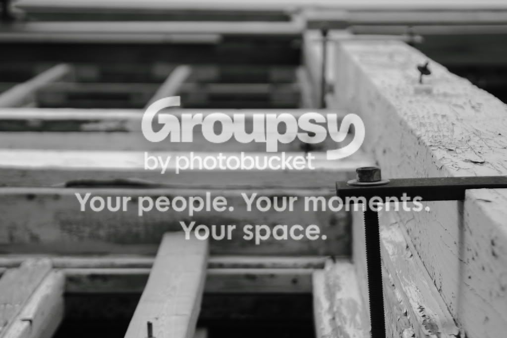
#1 is the only one I really liked. There's sort of an optical illusion with it. If you look at it one way, it looks like your camera is pointed upwards towards some windows. If you look at it another way, it looks like some kind of wood framing framing that you're viewing from straight ahead (as in, the screw is facing towards the ground). In my opinion, that alone makes it a great picture. Keeps your attention.
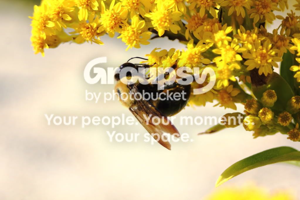
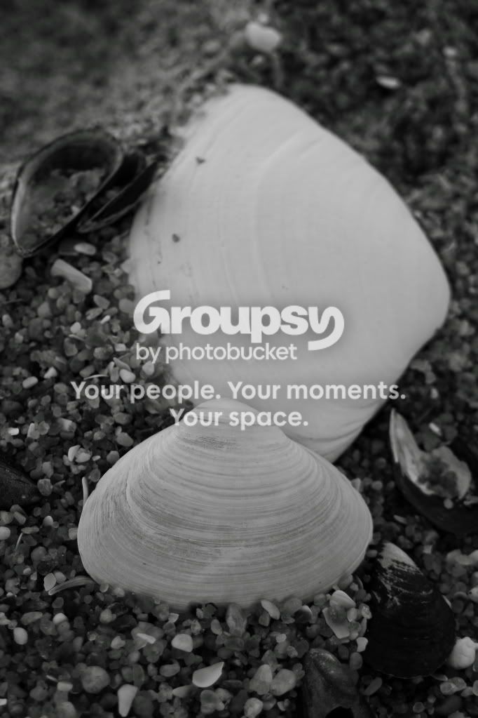
The bee and shell pictures are almost there.. but something's just not grabbing me.
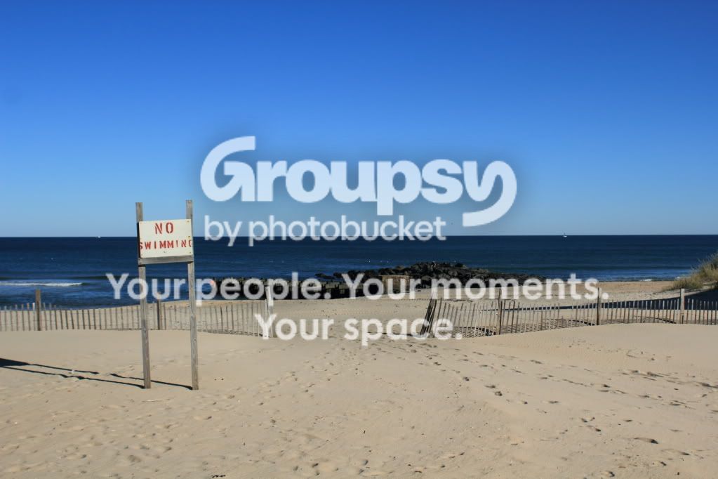
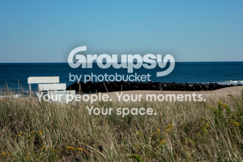
2 3 and 4 are all pretty boring to be honest. Colors are screwy on 3 (sky is dull, grass is pale, whites are blown, rocks are really dark). 3 is also pretty out of focus.
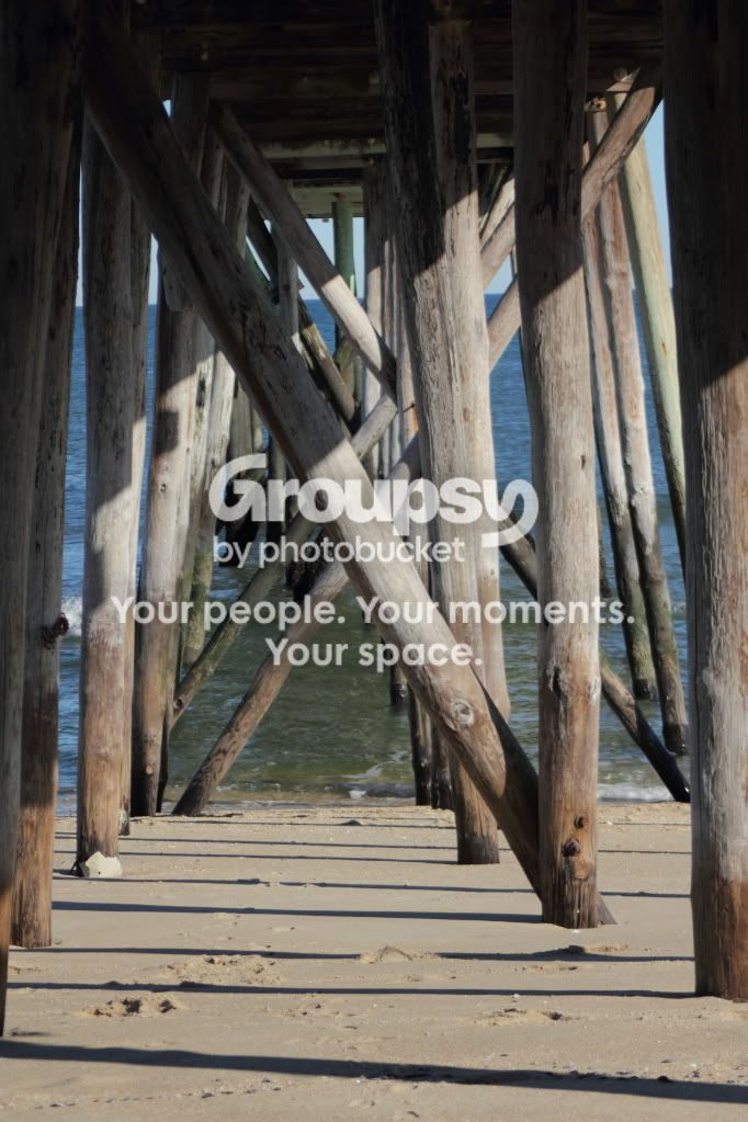
#4 is tilted counterclockwise, and the colors are washed out. There's nothing popping in this one either.
Personally, I'd keep #1 and #7 and scrap the others.