What's new

Alone in space

Snakeguy101

TPF Noob!
Joined
Dec 5, 2010
Messages
717
Reaction score
63
Location
Gainesville
Can others edit my Photos
Photos OK to edit
Went to the GA aquarium this weekend and got some good shots but this one stood out to me and I wanted to share it here. I am now seeing some specs in the black areas (possible bad pixels on the sensor?) but have removed them already- just didn't notice until after I uploaded the image. Anyways, let me know what you think! Thanks.
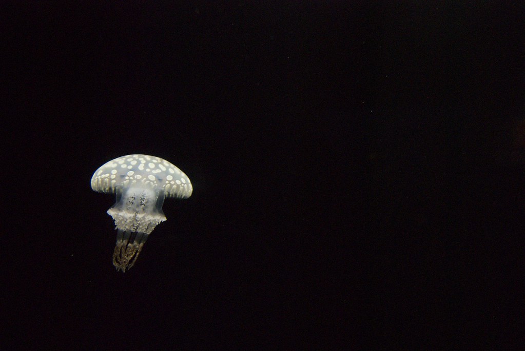
6251875995_1677584be2_b.jpg


Here is a link to the Flikr set: http://www.flickr.com/photos/snakeguy101/sets/72157627786501073/
 
Last edited:
I have a hard time with small solitary subjects in vast fields of nothing.

I see by the title what your thoughts are behind this. To share m sensibility, I would do a portrait crop, and place the jelly in the upper right. My thinking is that a shape or form up high in the frame suggests lightness, mobility, or flight. The shape or form low in the frame suggests weight, seems heavy and "grounding". The jelly's sweeping gesture would make more sense(to me) in the upper right, rather that the upper left. It also would create an implied diagonal to the bottom left corner.
 
Okay, thanks. Are you saying just to crop more from the right? I am not sure I understood you 100%. I get what you mean by what is implied by the space but I cannot visualize how it is you want me to crop it...
 
If you cropped it, tho, wouldn't you lose most of the "space." In order to get the jelly to the upper right and keep the space you'd have to edit it.
 
fe3a2501.png


See, to my sensibilities, the jelly being in the upper right feels light, feels like it's "airborne" if you will. It's implied diagonal line of motion goes mor or less to the jelly, from the bottom left corner. This feels right to me. It feels balanced. It feels like it fits the jellys direction of travel.

Your image, to me, feels heavy. Bottom weighted. With too much space to the right and above the jelly. It "feels" very unbalanced.


These are my sensibilities, yours and others may vary. :)
 
I see what you are getting at and I like your edit- it definitely changes the image a lot. I still think that I prefer the heavy feeling though and I prefer to leave more room for the subject to "move into the frame". I will play with some different crops and see what comes of it.
 
Yeah, I am by no means saying I am right or wrong, or one is better than the other beyond how I see things. :sexywink:


My other half, without knowing who did which, described yours as feeling lonely, and mine as feeling active. So, the feeling of yours fits your title, which my edit totally changes the mood. :D
 
fe3a2501.png


See, to my sensibilities, the jelly being in the upper right feels light, feels like it's "airborne" if you will. It's implied diagonal line of motion goes mor or less to the jelly, from the bottom left corner. This feels right to me. It feels balanced. It feels like it fits the jellys direction of travel.

Your image, to me, feels heavy. Bottom weighted. With too much space to the right and above the jelly. It "feels" very unbalanced.


These are my sensibilities, yours and others may vary. :)


I like this crop.
 

Create an account or login to comment

You must be a member in order to leave a comment

Create account

Create an account on our community. It's easy!

Log in

Already have an account? Log in here.

Back
Top Bottom