None of us can answer the question "Am I on the right track?", however we can give you technical advice and suggestion which may improve them. So, to that end:
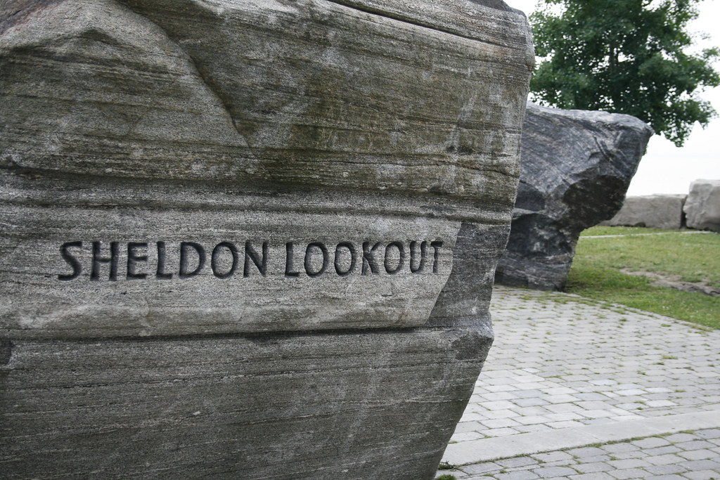
1. As an impartial observer, this picture isn't very interesting; okay, there's a sign carved in the rock, but it needs something to situate it. Perhaps a wider view, or different perspective including some of the path to the right? Technically it's okay with the exceptions of the nearly blown sky and over-exposed sidewalk. I'd suggest a levels tweak, and perhaps a saturation boos to get a little more colour in the grass and bricks.
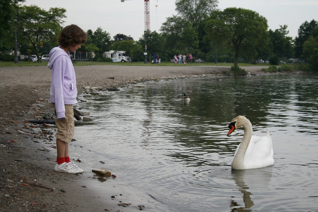
2. This one had real potential, but doesn't quite make it. The main subject is clearly the child and the swan. Since they are both on the same plain, or close enough to it, a nice, shallow DoF would have blurred all of the background and focused the eye on those two things. The other point to note is that the curved bank leads the eye right past the main subjects and out the RH side of the image. Always use lines like this to your advantage. As well, I think a better perspective, say moving a couple of feet to your right (yes, you might have got wet; that's the price we pay for good images!
")
) would have included all of the swan, allowed you to see a little more of the child's face, and had [potentially] a better background (it looks like more trees and less "stuff"). Comments as per 1 for sky and saturation.
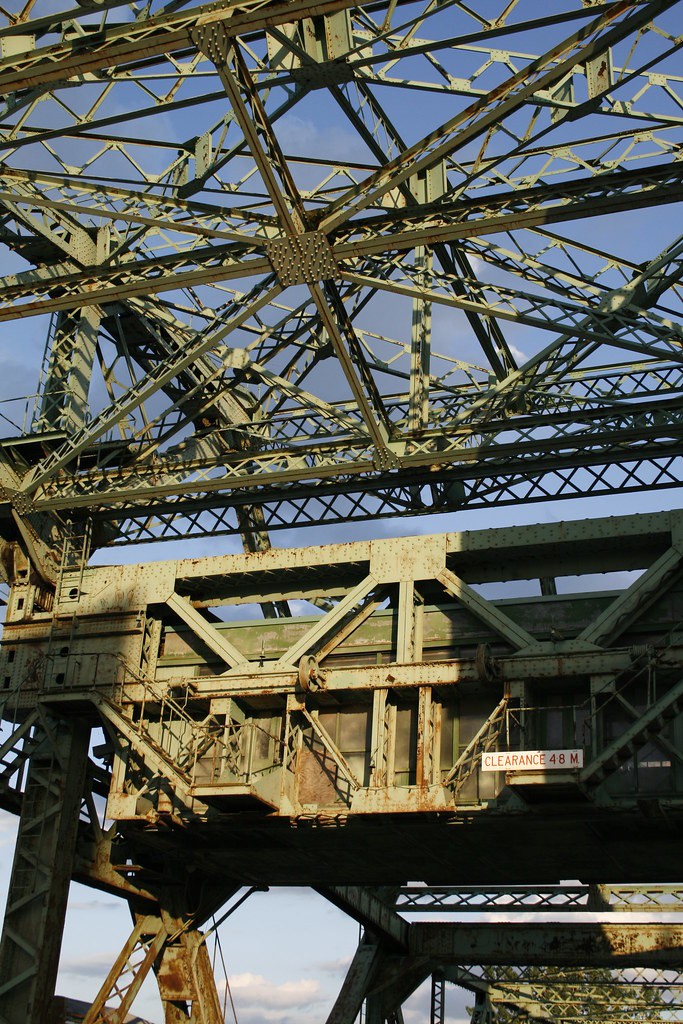
3. Nice - although I'm not a fan of the angle. The only real comment is that the large dark shadow under the "Clearance" sign is rather distracting. Do you have a Circ-POL filter? That would really have made the sky in this one pop.
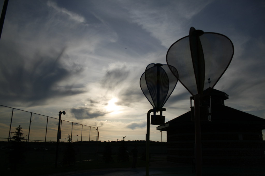
4. A neat idea, I like the shapes, the fence and the other elements; this one needs to be straightened however.
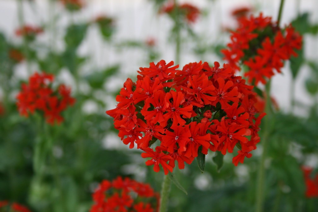
5. Nice macro work, and much better use of selective focus, however there's too much unused space in the image. The rule of thirds is by no means hard and fast, and in a case like this, I think filling or nearly filling the image with the one cluster of blooms would have worked fine.
6. I like this one. I would consider cropping the brush on the LH side, or skewing the perspective a little to eliminate it. Other than that, refer to one about comments on sky and saturation.
Just my $00.02 worth - your milage may vary.
~John