What's new

Ansel/Amanda Approach

Nikon Fan

TPF Noob!
Joined
Nov 2, 2004
Messages
3,524
Reaction score
49
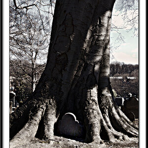
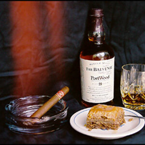
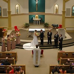
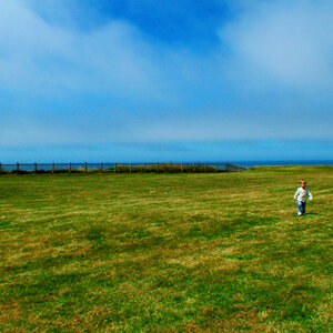
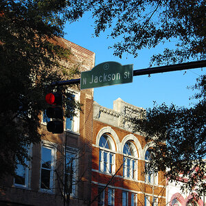
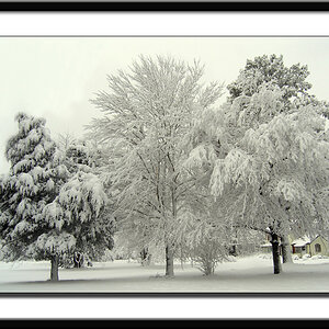
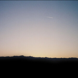
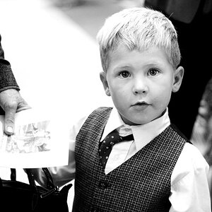
I just learned a new ps conversion technique similiar to Ansel Adams approach. I combined it with my own flare and came up with these. Be as critical as you like, I'm really not sure about them at the moment. They're growin on me though. Are they way overdone, and give me some honest feedback here.
By the way I'm in no way comparing myself to Ansel Adams...just using a technique that is referred to as that with my own flare added :)

IMG_1415edit1.jpg


IMG_1419edit1.jpg


IMG_1429edit1.jpg


IMG_1408edit1.jpg
 
The whites feel really blown out to me...

I really like #4 though.

What exactly is entailed in the Ansel/Amanda technique?
 
I just edited this and switched 3 and 4 with two more contrasty ones.

The technique involves creating a channel mixer layer...putting red at about 160, green 190, and blue at -200, check monochrome, then move constant to your liking. This is Ansels part. Amanda then goes back to the bg layer and adjusts contrast, sharpens, and curves if needed.
 
im not too keen on the the last three, but i really like #1 a lot! wtg for experimenting with this. you are definately on to something Amanda! :thumbup:
 
The first one is :thumbup:
Great job on the conversion! :)
 
I really like your subject matter, but they just look like high-contrast images to me. Sometimes high contrast can be really effective, though. :thumbup: It works in some images, but not all of them.

I kind of like #3 because the high contrast lends a surreal effect to the subjects, but the rest come across looking overdone. :) Just my opinion.
 
Thanks for the honesty all :) I agree they are overdone, but I'm a fan of really contrasty images also...I'm liking #1, and four is growing on me, but I'd say two is definitely a wash, I'll have to post the color version tommorow. Definitely fun experimenting though...
 
This is the stereotypical butterfly...but I honestly admit the color is much better than the conversion:

IMG_1422edit.jpg
 
looks infrared to me. cool :)

but i do like the butterfly one better in color.
 
I like the 4th one. But on the others I find white colour too blown out. Too much contrast maybe? But the last one is nice! :)
 

Create an account or login to comment

You must be a member in order to leave a comment

Create account

Create an account on our community. It's easy!

Log in

Already have an account? Log in here.

Back
Top Bottom