
echoyjeff222
No longer a newbie, moving up!
- Joined
- Jun 27, 2010
- Messages
- 643
- Reaction score
- 140
- Location
- WA
- Can others edit my Photos
- Photos OK to edit
Hey all,
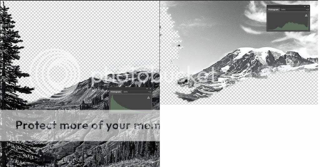
I ended up going to Mount Rainier yesterday for some shots. This is the first one I've processed. I'm not too sure how the conversion went - I definitely like the composition of the picture, though. I used the channel mixer to convert to b&w. Besides that, I dodged/burned and did some basic contrast adjustments, but that's about all. Feedback would be appreciated! Thanks!

3638Edit by echoyjeff222, on Flickr
I ended up going to Mount Rainier yesterday for some shots. This is the first one I've processed. I'm not too sure how the conversion went - I definitely like the composition of the picture, though. I used the channel mixer to convert to b&w. Besides that, I dodged/burned and did some basic contrast adjustments, but that's about all. Feedback would be appreciated! Thanks!
3638Edit by echoyjeff222, on Flickr


![[No title]](/data/xfmg/thumbnail/39/39533-c2c39d37e833a4689533c897ace8c348.jpg?1619739073)

![[No title]](/data/xfmg/thumbnail/39/39294-339c772c727b255b9451f2639f2bc28e.jpg?1619738959)

![[No title]](/data/xfmg/thumbnail/37/37625-7e132688457d56e50320a8c99a79fe38.jpg?1619738154)

![[No title]](/data/xfmg/thumbnail/37/37624-7f9c9a5c8c7bcb5e62f67313e2e48dbc.jpg?1619738153)
![[No title]](/data/xfmg/thumbnail/36/36299-468f060314a0ac2bf5e37da1c33149d2.jpg?1619737493)
![[No title]](/data/xfmg/thumbnail/32/32708-c55da623febe9d91efe5f28aa54c3090.jpg?1619735612)