That's an interesting question... but rather than answer it directly, let me give you my thought process.
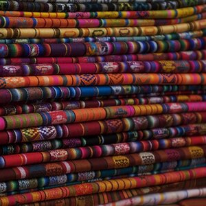
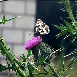
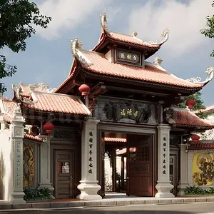
Images have a number of things going for them... texture, lighting and shadows, contrast, pattern or rhythm, structure, leading lines, perhaps tension, etc.
COLOR... on the other hand, is an element of the image that can be very strong. So strong, that if what you want to do is bring out the OTHER elements of the image, then removing the color can eliminate a distraction. The image goes from a documentary shot the eye is expecting, to something less real because the color we'd see in real life has been removed. We can only look at whatever is left over.
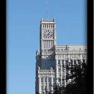
SO... if what I want to do is bring out the textures, or structure, etc. (especially if I have a nice high-contrast image) then I'll consider converting it to black and white.
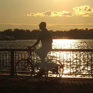
But sometimes the colors help make the mood. Floral scenes, sunsets, etc. are often about the warmth, vibrancy, or even softness of the color. Color can add excitement in a scene that you want to appear edgy (a night club scene, for example) -- and desaturating color (use of muted values) can sometimes provide a kind of softness. So in these cases, I leave the color in.




![[No title]](/data/xfmg/thumbnail/33/33450-b94d8a06a911e01c39df688c57b4745e.jpg?1734163488)


![[No title]](/data/xfmg/thumbnail/35/35880-9a6926237907ab72b42781d9a09698a6.jpg?1734167640)