Beach Shots - Critique Please

HaydenS

TPF Noob!
Joined
Sep 29, 2007
Messages
24
Reaction score
0
Can others edit my Photos
Photos OK to edit
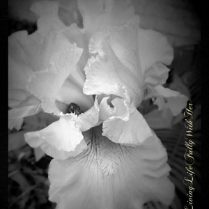
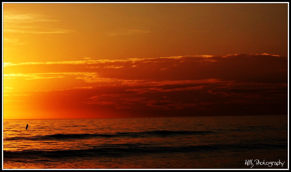
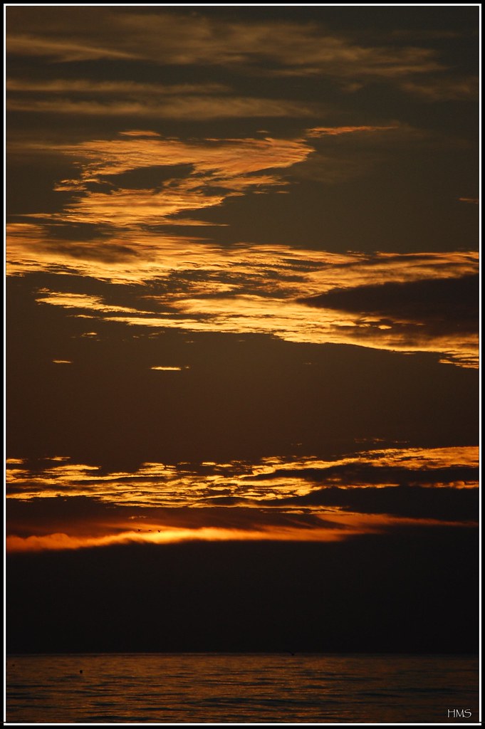
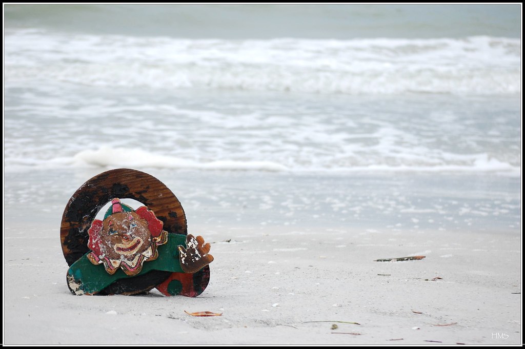
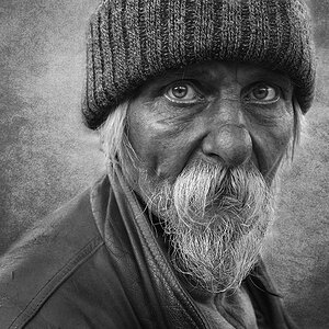
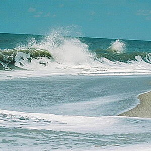
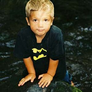
I'm brand new to photography - only a few months - and I'm quite young (still in high school). I've never taken a photo class or anything like that so everything I'm learning comes from online, magazines (photopro & shutterbug) and from practice practice practice. I'd love some help where I could get it so here's a few pictures that I took when I went to my beach house recently.

Also, I don't have photoshop yet (probably getting it this weekend) so none of these have been extensively edited - some contrast / color / crop edits but definitely nothing big.

2250195588_8df58cd250_b.jpg


2249400105_d0f08820cf_b.jpg


2249400367_fdc62fcf98_b.jpg


2249400251_6a82c8411d_b.jpg


2250195776_9177958c39_b.jpg

2250195314_8765db6803_b.jpg


2249399683_18bae3c172_b.jpg


Thanks for looking and ANY comment is welcome - I would really love to hear what you have to say - be it good or bad.

Hayden Schottlaender
 
i love the clown! the sunset in #1 is awesome.
I would just try to have your horizons straight. other than that, very good.
 
You sure already have "the eye" and see beauty where others might walk past. You know well what to frame and are also on a very good path onto knowing how to frame it. There may well still be some technical obstacles for you to go by, but all in all I am quite impressed with your photos here.

The first photo is a wonderful transition of colours from sunset-yellow towards night, I find capturing that like you did really nice.

The log-on-the-sand-photo suffers from a bit of camera shake, maybe because you assumed a difficult (very low) position which strained your muscles a bit and made you shake.

The sun looks funny in the one to follow, as if it were leaking, and to my eyes (which don't deal well with bright lights), this one hurts a little, so I personally would not want to look at that particular photo for too long. But, of course, that's just me.

Photo 4 looks deliberately underexposed to work out the detail in the sky and bring out more of the reds and I like that! I think you chose well to have that one thus underexposed.

The palmtrees are my least favourite of the series, it just does not convince me ... I think there is too much framing (by the palmtrees), but too little a subject ("blue ... what is it? It is so blurred!")

The bokeh (aesthetic quality of blurred background) in the photo of the pier (telephoto lens) is ... funny. I don't like it. It needs to be blurred, yet there is a sharpness to the blurriness ... which confuses me.

And now the last.
Winner of the set!
Very nicely spotted. Framed well. Maybe, if you had Photoshop, youl could have given a smidge more light to just the clown to bring it forward even more, but it is also quite a nice photo as it is.

Keep shooting!
And presenting your photos! :D
 
thank you for the very kind words and helpful criticism. Now I just need to get photoshop!
 

Most reactions

New Topics

Back
Top