brandonbpm
TPF Noob!
- Joined
- Nov 26, 2012
- Messages
- 26
- Reaction score
- 14
- Location
- Cleveland, Ohio
- Can others edit my Photos
- Photos NOT OK to edit

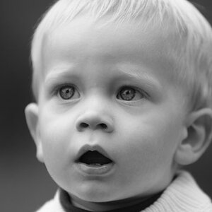
Inverted Stare by BrandonBPM, on Flickr

Weariness in Mixed Lighting by BrandonBPM, on Flickr

A Softer Side of Boudoir by BrandonBPM, on Flickr
The color balance on the first two photos is intentional, and I suspect that many may not be a fan of the adjustment, but it was a personal choice of preference for me.
![[No title]](/data/xfmg/thumbnail/31/31980-e5048a424621c7b3cd0d306d63c09d67.jpg?1619735137)


![[No title]](/data/xfmg/thumbnail/37/37130-15360a524d273bc7dcd0beda3e9299ee.jpg?1619737884)