Before and after, but... is it 'after' enough?

I like the edit. Including the speed sign. It conveys to me that he is in the middle of nowhere, where all you see is speed signs. I know, I'm not much help.
 
I just took a look at a 3:4 portrait crop. The 80 sign is excluded. It has the runner, the reflective orange post only. It shows the backdrop of the sky and horizon extending a little higher than the telegraph wire overhead. It has some of the orange reflection on the roadway but omits the curve at the foot of the sooc that is coming back into shot towards the middle. IMO this looks remote. It's got the blue/orange combination across the frame which looks good.
 
For my money, I think your edit went overboard on the orange reflection. I think it would be better if you remove that altogether, and then decide on the signage, etc. I'll take the signs over the reflection.
Interesting point, thanks. I hadn't actually thought of that.

I like the edit. Including the speed sign. It conveys to me that he is in the middle of nowhere, where all you see is speed signs. I know, I'm not much help.
Thanks! :)

I just took a look at a 3:4 portrait crop. The 80 sign is excluded. It has the runner, the reflective orange post only. It shows the backdrop of the sky and horizon extending a little higher than the telegraph wire overhead. It has some of the orange reflection on the roadway but omits the curve at the foot of the sooc that is coming back into shot towards the middle. IMO this looks remote. It's got the blue/orange combination across the frame which looks good.
Hmmm... okay, I freely admit to being a stuck-in-the-mud, dyed-in-the-wool 4:5 guy; I need to get out more and try other crops. Thanks for that!
 
One of the images I shot yesterday during my Wounded Warrior run coverage struck me as having some potential. I wanted to produce an image which helps to convey the long, lonely and often difficult nature of the run these folks are doing.

I started with this (more or less SOOC) image, captured just after sunrise on a heavily overcast and drizzly morning:


and so far, have gotten here:
(For some reason these are both showing up darker than they should here). Basically tweaked the colours, cropped & removed a lot of the "stuff" out in an effort to try and portray a long, lonely stretch of road (The reality is this is a major intersection and there's a coffee shop, chippy, and dog-groomer's within 100', but.... )

So.. have I gone far enough? Too far? Wrong direction? All comments, suggestions, etc appreciated!

I definitely like the 1st best. All the signage gives a sense of place, and the background gray sets a realistic mood. And as said above the mood is that of a lone(ly) runner doing his own thing. There truly is a story in that first shot, very little in the 2d which to me seems to be going fro a cheap joke.
The only thing that really sucks is that bright orange/yellow striped post next to the runner.
 
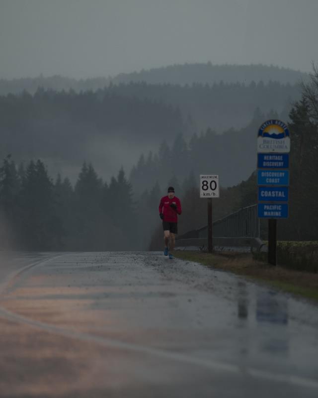
Okay... based on suggestions from the crowd, as well as some thoughts of my own, here's version 2.0. I've gone wider as suggested (but removed the telephone pole image right; that heavy black line was killing it for me) and gone with a more bluey-greeny tone, which I like better, but doesn't (in my mind) make it look quite as miserable as it was. Thoughts?
Geoff3_Small.jpg
 
Okay... based on suggestions from the crowd, as well as some thoughts of my own, here's version 2.0. I've gone wider as suggested (but removed the telephone pole image right; that heavy black line was killing it for me) and gone with a more bluey-greeny tone, which I like better, but doesn't (in my mind) make it look quite as miserable as it was. Thoughts?

It looks GREAT to me but come on! pass me the RAW file, I´d love to play with that one!
 
I certainly like the second version better. I do love the composition as well as the colors. The curved line at the bottom helps to keep my view within the runner as well. From it's upper end I am directed at the mountains while it's lower end in the bottom right corner directs me to the path in front of the runner. The blue sings give balance to the 80 sign, as if it was just the 80 it would've looked as if it's a bit a mocking. The background composition of the hills is also quite nice.

Speaking about exposure - it helps to portray the difficult and lonely path as was your intention.
The only bit that worries me - in the hills I can some kind of purple color - not sure it is just my monitor but it is strange.
 
Okay... based on suggestions from the crowd, as well as some thoughts of my own, here's version 2.0. I've gone wider as suggested (but removed the telephone pole image right; that heavy black line was killing it for me) and gone with a more bluey-greeny tone, which I like better, but doesn't (in my mind) make it look quite as miserable as it was. Thoughts?
Geoff3_Small.jpg

THAT's the keeper. Tweak it all you want, but thats the crop and mood! Kudos. really like this.
 
That looks good. Agree with the previous comments. Taking out the orange post and keeping in the BC signage looks good. Also have the curve prominent not just creeping into the foot of the image underscores with a nice swish.
 
It looks GREAT to me but come on! pass me the RAW file, I´d love to play with that one!
Thanks, and I appreciate the offer, but I'm going to keep this one to myself for now.
I certainly like the second version better. I do love the composition as well as the colors. The curved line at the bottom helps to keep my view within the runner as well. From it's upper end I am directed at the mountains while it's lower end in the bottom right corner directs me to the path in front of the runner. The blue sings give balance to the 80 sign, as if it was just the 80 it would've looked as if it's a bit a mocking. The background composition of the hills is also quite nice.
Speaking about exposure - it helps to portray the difficult and lonely path as was your intention.
The only bit that worries me - in the hills I can some kind of purple color - not sure it is just my monitor but it is strange.
Thanks! Ignore the purple; it's an artefact produced by the el-cheapo right-click program that I use to crunch a full res .TIF file into a ~50kb .jpg in 1-2 seconds.
That looks good. Agree with the previous comments. Taking out the orange post and keeping in the BC signage looks good. Also have the curve prominent not just creeping into the foot of the image underscores with a nice swish.
Cheers! :)
 
I am glad they don't let him go over 80, because if he hit 88 he may go BACK IN TIME!!!:345:

I really like the first photo, it is the best one to me! :)
 
Okay... based on suggestions from the crowd, as well as some thoughts of my own, here's version 2.0. I've gone wider as suggested (but removed the telephone pole image right; that heavy black line was killing it for me) and gone with a more bluey-greeny tone, which I like better, but doesn't (in my mind) make it look quite as miserable as it was. Thoughts?
Geoff3_Small.jpg

Definitely this one, for the win! :)
Thanks Lenny! Even in colour? ;)
 

Most reactions

New Topics

Back
Top