
chetanls
TPF Noob!
- Joined
- Dec 11, 2009
- Messages
- 18
- Reaction score
- 0
- Location
- Bangalore
- Can others edit my Photos
- Photos OK to edit
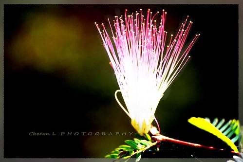
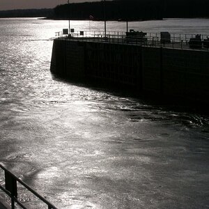
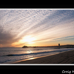
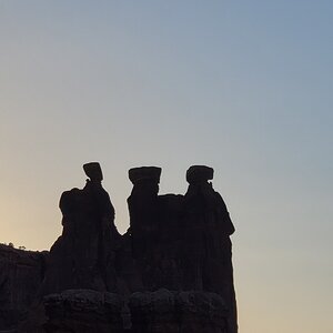
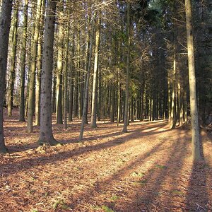
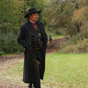
I am reaching out again with my next set of photos - this time, of flowers, and am specifically seeking comments on the post-processing done. I have used different blend-modes: overlay, multiply, screen...some gaussian blur, etc. My self-criticism at the bottom of this post, in case you want to look at what I think myself ")
1)
2)

3)
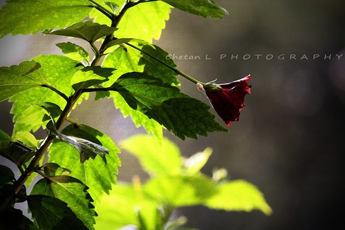
My self-criticism: having discovered the power of Photoshop, I certainly think I have gone overboard!...
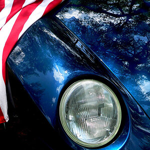
1)
2)
3)
My self-criticism: having discovered the power of Photoshop, I certainly think I have gone overboard!...
Last edited:

![[No title]](/data/xfmg/thumbnail/37/37626-4a6ffc3f17ab3a8e97170fda3276640e.jpg?1619738154)
![[No title]](/data/xfmg/thumbnail/39/39429-cfa441056f1e6a1995539dc87c794876.jpg?1619739028)
![[No title]](/data/xfmg/thumbnail/42/42464-98a778e864f4e6df2a9cc673b7549322.jpg?1619740192)
![[No title]](/data/xfmg/thumbnail/31/31749-6cf0f99d6bdedf47f7387c5b943fb717.jpg?1619734989)