Business Card - Thoughts?

Status
Not open for further replies.

DGMPhotography

Been spending a lot of time on here!
Joined
Mar 23, 2012
Messages
3,160
Reaction score
718
Can others edit my Photos
Photos OK to edit
Hello all,

I have already ordered these, so I hope they're okay. What do you think?
 

Attachments

  • $Screen Shot 2012-09-03 at 2.06.33 Am.jpg
    $Screen Shot 2012-09-03 at 2.06.33 Am.jpg
    91.2 KB · Views: 140
Cute design, I like the picture. But too many words, I think -"and much more" on a business card... hum, it reminds me of "Cheap!" and "BARGAIN" ads.
 
How many did you order? What type of photography are you hoping to be hired for? You have tumblr and FB but no personal website. Next time do a search for what makes a business card memorable. If I run across the link in the morning, I'll post it for you.
 
Last edited:
  • You note "Logo/Ad Design" among your services, yet you have no logo on your business card and the design is ho-hum basic business card style. You're not going to attract design customers with this level of design skill.
  • Putting "Proprietor" below your name sounds a little pompous. Everyone already knows the DGM is you.
  • If you are going to put a photo on the card, put your BEST work that suits a business card. That alternating blue-gray mountain scene might be great for a kayak rental company in Iceland, but it looks weird for a photography professional in Virginia.
  • As already mentioned, get a real website and display it alone - no tumblr/facebook.

Why ask our opinions if you've already ordered the cards?
 
I'd reccomend that you get a privat domain, and get an email with the same domain (not gmail)
 
All great points above-Jaemie is right on. It is definitely too busy. I do kind of like the idea of an appointment time on the back. I will admit I used to have a card kind of like this, where i listed all the kinds of photography I did, had my AIM name, MySpace, everything under the sun, plus a photo. I have since gotten much simpler, just my logo, business name, phone, e-mail and website.
From a design perspective, all the jagged lines on the text really bug me, as does the mish-mash of font faces. Also, the small caps has reduced the baseline of the number 7 in your business name, so it's hanging out halfway in the row below.
 
All the key points are already noted with respect to the design. I would bin this, and go to a professional printer (you know, like we expect people to come to professional photographers) and have them help you with this. I started out with an idea like yours, and when I went to see a friend of mine who runs a printing shop, she helped me sort it out (after she finished laughing), and I wound up with a very plain card with my logo, name and contact information. At a recent business seminar I attended, I received a number of compliements on the clean, simple, and easy-to-read design of my cards.
 
I'm a bit hesitant to offer advice when you've already ordered them, but oh well. As others said, it is very busy and you have way too many things on there.

The main thing is where do you want your clients to go? Your FB? Your Tumblr? You want them to e-mail you? You want them to call you? That's too many things for them to do. You need to funnel your customers to where YOU want them the most. The opening of your funnel catches your customers - and you can make that funnel as big as you want i.e.: store displays, websites, direct mail marketing, word of mouth, but your funnel has to go somewhere solid.

I funnel all of my customers through my website. I have a local display and business cards where they have one thing on them, my website. I do this because once they go to my website they know what kind of work I do, my style, my policies, my pricing, and common questions about my work, before they ever try and contact me. It eliminates the issue of a million different customers from a million different places who all know different things, or nothing, about me. Saves me from having to explain it to everyone.

Also, I see in the middle it says free business card, so I'm inclined to say you just used one of those free websites that has templates on it? If so, I'd be concerned if that photo was just a stock photo and not yours. Not accusing, but for a photography business people would assume that is your photo, and you don't want to give that impression if it isn't.
 
tirediron, you're a fine fellow when you're not moderating me (when, of course, you are pure unadulterated evil and also fat), but I'm not sure that getting props at a business seminar is necessarily going to translate to business!

The original card looks like the kind that get left in little piles at the coffeeshop or wherever. They're kind of mini-flyers, and I feel like being packed with info and colorful is a good thing for a flyer. As a handout, they're not going to be as good, since they're probably going to conflict with the in-person impression you're giving. I'm not a marketing expert by any means, but I've audited the course.

I wouldn't trash these, I'd think about where I can leave little stacks of them around, though, and get a new design as an in-office and in-person handout.

In fact, you might pull together a couple different designs to leave behind in little piles, with different email addresses/phone numbers, to see which ones generate the most business in your area. Local tastes do vary.
 
I think the image you chose isn't good for graphic design layout.

All the info is there but I think you should change the image.
 
tirediron, you're a fine fellow when you're not moderating me (when, of course, you are pure unadulterated evil and also fat)
:whip:
...I'm not sure that getting props at a business seminar is necessarily going to translate to business!
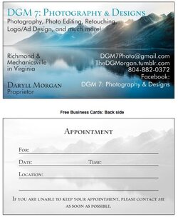
Hard to say; my point was that both a professional printer and people who were in the business of teaching business (at a fairly high level normally) agreed that simple was better. I find it rather hypocritical that we (for the most part) advocate the use of professional photographers for their skill and knowledge, but then decide that when it comes to a business card (still a VERY important aspect of your business in many ways) assume that there's nothing to it and will just grab some free template.

The original card looks like the kind that get left in little piles at the coffeeshop or wherever. They're kind of mini-flyers, and I feel like being packed with info and colorful is a good thing for a flyer...I wouldn't trash these, I'd think about where I can leave little stacks of them around, though, and get a new design as an in-office and in-person handout.
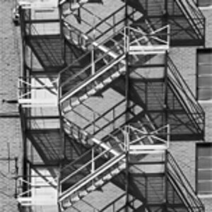
I'm still of the 'simpler is better' school of thought, and while I've never seen this done with cards, it is rather a good idea!
 
Agree with the others. Too many font sizes and shapes. Too many places to go (I'm not even sure what to do with that Facebook line). A free email. You're the "proprietor"? What, are you selling soap and pickles in a general store? What's the back? Is this an appointment card you give to people after they come to you, or is this something to hand out.

I'd keep working...
 
These days everybody is a graphic designer. These days everybody is a photographer. These days everybody is an advertising copywriter. These days everybody is a proprietor. These days everybody is a photo editor. These days everybody is a photo retoucher. These days anybody can design business cards at ye olde family PC. This card seems very appropriate for the era in which it was designed for.
 
Status
Not open for further replies.

Most reactions

Back
Top