C&C My first formal portrait session.

jcskeeter

TPF Noob!
Joined
Nov 7, 2010
Messages
83
Reaction score
6
Location
Minnapolis, MN
Website
www.jamescordell.com
Can others edit my Photos
Photos OK to edit
Looking for some critique on the lighting and touchup. There wasn't much post on the male but the female had some. What do you think? Thanks!

#1
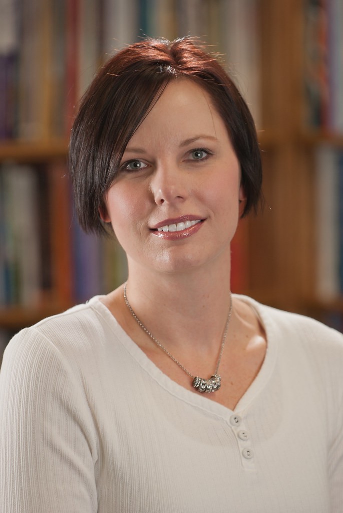
Formal Portrait - Female by jcskeeter313, on Flickr

#2
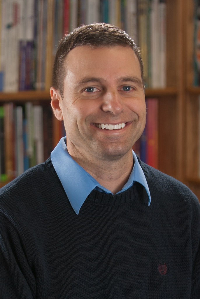
Formal Portrait - Male by jcskeeter313, on Flickr

Cam and Strobist Info:
Nikon D80 1/60th f/2.8 ISO100
70-200 2.8
PW Flex TT5s (used iTTL mode)
1 SB700 with softbox cam right (key)
1 SB700 w/ softbox cam left behind model (rim/fill)
1 430EXII bare for hair light on boom

 
Keep in mind that I'm new to this...

They look a bit underexposed on my monitor.

The key light could have been a bit higher...but that's just my preference.
 
Light on the right is to low, light on the left is to strong and to much to the side, hair light should be more from behind.
 
Light on the right is too low, light on the left is too strong and too much to the side, hair light should be more from behind.

Although these are quite sharp and comfortable, I agree with MReid about the lights. The side slight is so obvious that it gives the impression that the face is in the shadow.

I am pretty prejudiced about most 4 x 6 portrait ratios; I think the portraits in that mode generally end too low on the torso with nothing gained.


684296003919c4643915b22.jpg
 
BTW, if you did work on the woman's face, it was nicely done. It doesn't look over-worked or edited. She is quite lovely and her personality seems to shine through in the picture.

The hair seems a little ruffled for a 'formal' posed picture but that, imo, adds to the charm of it.
 
I definitely see what you guys are saying about the key light. Not enough power and positioning is off. What's a typical height for the key in relation to the subject's head or eye-line? Let's say from the top of the light stand, where the light source is. In these shots the model was sitting on a stool.

I like your crop Traveler. I didn't think to constrain it to a different ratio. Just locked it in as is. Although I did intentionally leave a little extra cropping space for the client to do what they pleased with them. ;)

I'm glad it doesn't come across as overworked. These were for a company so they could put there headshot on mailers and what not for the customer to see the person they're working with. With that in mind I didn't want it to seem like a mag cover or something. Her skin was tricky though. She had a couple blemishes that weren't a problem but overall I think she had some acne damage or something that I smoothed out just a little.

Thanks for the advice.
 
*Sorry Admins for cross-posting. Won't happen again. I would delete but I can't seem to find the option, if there is one.
 
I see the same difference for the side lights (one is a bit too strong the other one is a bit too low). I see this more on the male than the female. I guess this is due to the head angle of the male. Also by looking at how out of focus the background behind the female than male, I can say that she stood closer to the camera leaving the sidelights slightly behind(comparing to the male). This could be the other reason why lighting effect looks harsher on the male portrait.

Strongly agree with the aspect ratio uncessary vertical coverage.
 
What's a typical height for the key in relation to the subject's head or eye-line?

A good place to start is 45 degrees up. I usually go a bit lower... maybe 30. Sometimes I go steep shooting directly down from overhead. It very much depends on the mood of the photo. I recommend taking a series of shots of the same person in the same pose and just move the key light around them changing both the horizontal and vertical angle in an organized way so you can get a feel for how the look changes. And don't stop at horizontal, try below their eyeline as well...
 

Most reactions

Back
Top