C&C Please and suggestions on how to improve post editing

CaptainNapalm

No longer a newbie, moving up!
Joined
Nov 27, 2012
Messages
796
Reaction score
143
Location
Toronto, Ontario, Canada
Can others edit my Photos
Photos OK to edit
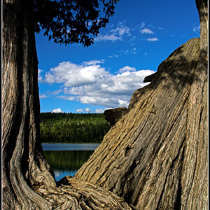
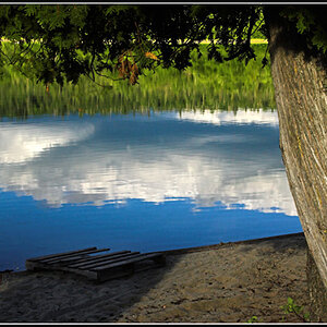
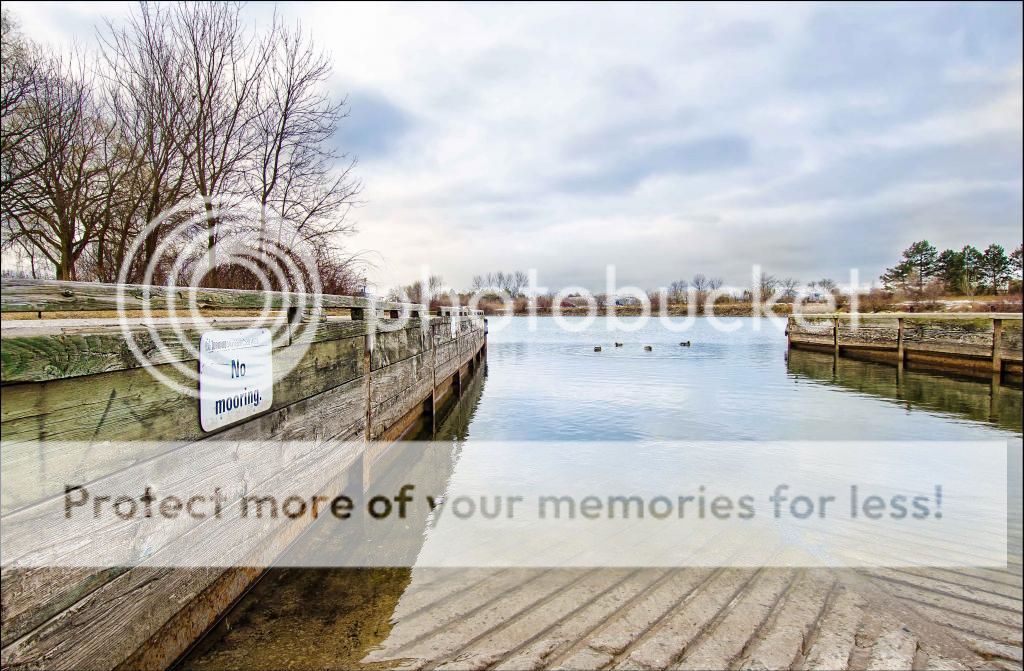
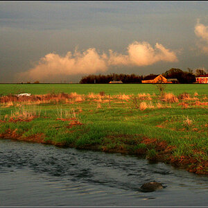
It was one of those really freezing, dark, cloudy, ugly days here but I decided to hit the lake front and see if I can take some pictures this morning. Because it's winter here and everything is colourless and very dark all my shots came out boring. So instead of throwing away the pics my goal was to try to do some constructive post editing. Basically I cropped the photos a bit, tried to bring out at least some colour in the scene/subjects, tried to give the clouds in the sky some character by adjusting shadows/highlights, did some sharpening, adjusted exposure, and tried to adjust the white balance as best as I could. I basically tried to make the pictures more interesting to look at. I'm very new to post editing and I'm looking on some feedback for these two shots in terms of how they could have been composed better or improvement in post processing. Thanks in advance!
$Harbourfront 13-03-01 (4)_edited-1.jpg$Harbourfront 13-03-01 (7)_edited-1.jpg
 
Shooting down on an animal like that just never works for me. I know sometimes it's all you can do, I have the same problem at a couple of the lakes around here. In general when you shoot down on something it puts them in a subservient or subordinate position. When you shoot up at something it elevates them to a superior position, such as a king on a dais. You got an excellent exposure and the color saturation is exactly what I'd expect from those conditions, I just don't care for the composition.

The first one is better. As small as the ducks in the water are the eye is drawn right to them by the lines of the dock edges.

Thanks for the input. I've heard your advice before so lately I have been trying lower angles on what I can but this duck was just impossible to get at in this way, and well... I wanted a duck so. I was catching it on the far end of the zoom standing on top of a high dock. I appreciate the advice.
 
Post the un-edited images beside the edits.

Do you know how to dodge and burn? Enhance local contrast? Select just a portion of an image to limit edits to the selected area, or just the opposite, limit edits to everything exzcept the selected area? (local as opposed to global editing)
 
How you don't mind, but I tweaked the first one a little.
Increase saturation on all but red channels, and tighter crop - that's all.

$Harbourfront 13-03-01 (4)_edited-1a.jpg
 
How you don't mind, but I tweaked the first one a little.
Increase saturation on all but red channels, and tighter crop - that's all.

View attachment 37731

Very nice, I actually really like that. Like you I prefer more colour in my photos (such as you edited it) but lately have been forcefully holding myself back from over saturating colours since I use to go overboard and in turn making them unrealistic. Hard for me to identify where to draw the line and what's too much so I try to play safe. But yeah your edit looks good to me. Thanks!
 
I first opened the image in ACR and adjusted the white balance to be slightly warmer, and globally capture sharpened.
In Photoshop - did some selective burning in the sky and on the water, selective sharpening (Sharpen tool) in the sides of the boat ramp, selected all except the sky and trees on the left, boosted the mid-tone contrast in that selected area, made a Vibrance adjustment layer and globally boosted the vibrance. I used the Magic Healing Brush to get rid of poles, lights, the bright blue on the far shoreline. I then flatten all the layers and opened the photo in ACR again. In ACR I used the Adjustment brush to add some blue to the sky and water.
Back to Photoshop, I added a thin black border.

HarbourfrontEditByKmH.jpg

This is some excellent advice. Thanks for all these details. Im going to use some of your techniques in my next edits. Photo looks great.
 

Most reactions

New Topics

Back
Top