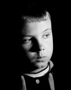
I think the first shot, the skin on the highlight side is too "hot", and on the shadowed side, the light drops off very rapidly into total blackness. The image seems quite somber for such a young person. You're right--moving the flash back farther would very likely lower the intensity of the fall-off; moving a light source farther away lowers both the intensity of the light AND it also lowers the rate of fall-off. When a flash is placed very,very close to a person and aimed in at a steep angle as was done in Shot #1, like say 3 feet distant, the light is extremely "hot" on the close side of the face, and fairly "dark" on areas just a few inches farther away. The easiest suggestion would been to have used a large reflector to bounce a little fill-in light on to the shadowed side of his face. Re-processing the, using a more-gentle tone curve would possibly help.
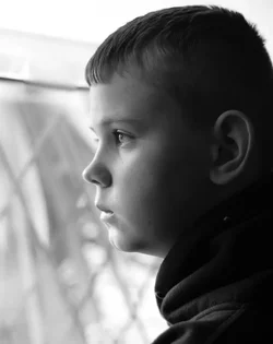
The second shot, the profile, has a lovely rim light effect all around the face! Nifty. But the background's strong geometric diagonals...oh, those are so,so distracting and compete very strongly for attention. I like the lighting pattern on the boy's face more than I liked the lighting on the first shot. I think the thoughtfulness or daydreaming emotion the assignment called for portraying comes through in his expression. Perhaps you could smudge the background's geometric lines and create a better background.


 Just looking for feedback really,


![[No title]](/data/xfmg/thumbnail/37/37602-1ef8dbb1c2d0e4ff347ee65d328c3603.jpg?1734170730)


![[No title]](/data/xfmg/thumbnail/37/37605-90c8efaef5b7d1f52d4bf8e7dfd33673.jpg?1734170732)