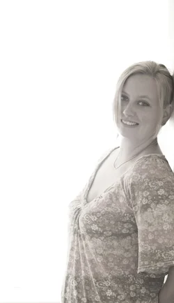
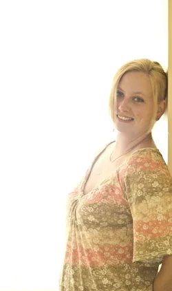
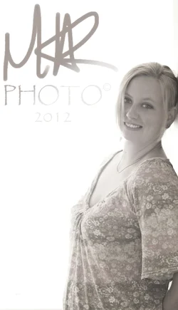
As a marketing tool I appreciate the amount of dead space. Regardless, I do think it's cropped too tightly on the right. It's cropped so that it looks like you're leaning against the edge of the frame rather than against the wall behind you (there's that tantalizing hint of shadow on the wall) that gives it a cramped feel despite all the dead space. I'm also not a fan of the little bit of bare skin on your arm remaining in this crop. I think you would be better off showing more of the arm, or possibly cropping some off the bottom so that you only show sleeve.
Besides the cropping, I like this. Your lighting looks well done, enough shadow to give your face some dimension without being distracting or obscuring. The bare skin on your chest is brighter than your face (generally a no-no), but with the brilliant white of the dead space my eye is drawn to your face rather than your chest. And I really like the processing - very desaturated, but just that hint of color remaining. Well done!







![[No title]](/data/xfmg/thumbnail/42/42483-f2f2bc205a7f02ea47df4ffc45d86e24.jpg?1734177007)
![[No title]](/data/xfmg/thumbnail/35/35263-86f580cf5d28d23109a45984030a79ad.jpg?1734166920)
![[No title]](/data/xfmg/thumbnail/35/35266-f58b019dadff6920c09071a847f052c3.jpg?1734166927)