C&C please...two candid portraits

crashcart

TPF Noob!
Joined
Jul 11, 2008
Messages
74
Reaction score
4
Location
Philadelphia, PA
Can others edit my Photos
Photos OK to edit
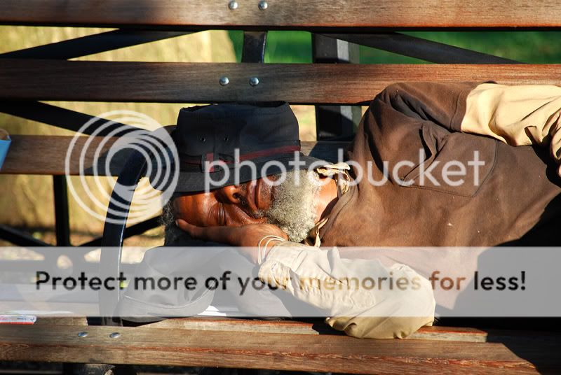
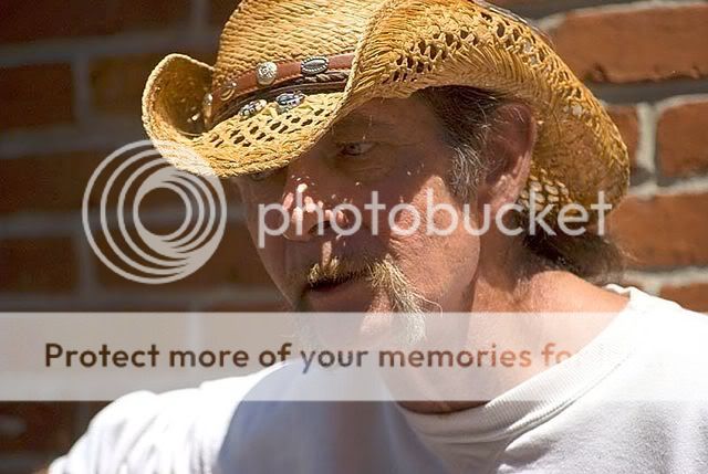
I posted these same pictures in the "people" thread, but no one responded. Hopefully, these shots don't suck so bad that they don't elicit any response. :roll:

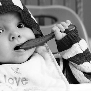
Just wanted to get an idea as to whether or not the photos are good from a technical aspect, i.e. exposure, DOF, etc.

Thoughts on the subjects or impressions that anyone has are welcome too! Thanks for taking the time to look.

MarketSerenader-small.jpg


parkbench08252008-smaller.jpg
 
first one could use a lil brightening in the shadow areas

I Really liek the 2nd pic :)

Would have been a little better imo
if you moved over and turned a tad so he was square to the camera
anda lil tighter crop

but i liek the 2nd one.
thta may look good In B&W as well
 
Hey, I have only a few comments to make. On the first one i find myself having to look deep into the shadow to connect with his right eye and I can't completely see the other eye. Maybe a little fill flash and slightly lower angle to see both his eyes completely?

I love the "expression or story" found in the second one. The lighting is very nice and warm. The bench i find to be a little distracting. Maybe if you were to cut it off at the middle arm rest or cut it off at the wooden slat directly above him. The bench adds to the story but is visually distracting. Im not sure how to go about finding a happy median.

I'm no expert here but I feel these suggestions would make the images slighty more appealing. Good luck with future portraits,

Nick
 
I do not like the first one because of the shadows and the expression is not all that interesting. The hat gives a bad shadow on his face.

The second one on the other hand is nice. I wish there wasn't as much room on the left as there is. More of the Mr.'s body would have been nice. There's something about people sleeping and getting them like this that's nice. The only thing that I don't like about this one is just watch out for LITTLE things in your camera. I'm a little OCD and am always looking out for those things like on the left side. That little thing on the bench and whatever is poking out at the lop left

Otherwise, alright shots

~Michael~
 
Agreed, although I think you might have been able to take a really awesome shot if you'd pulled back, and got his whole body.
 
Thanks for all of the input. This is exactly why I like to get C&C; not to have smoke blown up my ass, but to have good quality feedback on both technical and creative aspects!
 
Thanks for all of the input. This is exactly why I like to get C&C; not to have smoke blown up my ass, but to have good quality feedback on both technical and creative aspects!

Since you say that........................these photos blow. Put that in your pipe and smoke it :) He he.

~Michael~
 
I like the second one. I agree that if you would have gotten his whole body from a different angle, it might be a little better, but it's still a good shot!

I messed with your first shot in bibble. I added some fill light, which unfortunately, blows the white out on his shirt, BUT you can see the other portion of his face better. But there is still a shadow from the light. You could try dodging some of the shadow out in PS, but I always suck at that because I get dodge happy and then I end up messing up something I've just worked 20 minutes on.
ACK.
Anyway, here's just some fill light added.
MarketSerenader-smallbibbled.jpg


It also blows out some spots on his skin, but it beats the shadows, I think.
Direct sunlight has messed up PLENTY of pictures. But this shot, I think, is still really cool.
 
#1 It looks like you focused on his hat and not his eyes, this makes the image look soft to me and draws my attention to the hat first. The lighting on the image also gives some harsh shadows. imo the shadows draw my attention away from the subject as well.

Chewbecca gave a good example of what a brighter and sharpened image could do for you, here is an example of darker.

earl.jpg


When I see this guy I think of grit, so I made the image look gritty. I also tried to lead your attention to his eye fist, then the hat. Hope this helped a little, and pardon if I have rambled its 2am...
 
I especially like the second image - the warmth and color and interesting subject. But I would agree with others that there needs to be a little change in composition. I would definitely crop so that the some of the extra bench on the left side goes away, and the man is more centered...
 

Most reactions

New Topics

Back
Top