What's new

Catherine - THE Angle

manaheim

Jedi Bunnywabbit
Staff member
Supporting Member 📸
Joined
Sep 2, 2005
Messages
14,457
Reaction score
3,329
Can others edit my Photos
Photos OK to edit
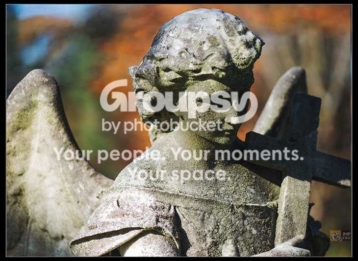
This was the angle I wanted her at... I just had to work on removing some undesirable elements before posting her.

Concord%20Cemetery%20-%20046.jpg


c/c welcome.
 
This ange is a bit disturbing me. Why left wing is cut off and right one is not visible at all? And background on the right looms over the image. Otherwise nice image.
 
I believe this is what Derrel would call "as in painting," a style I'm particularly fond of.
 
  • Thread Starter 🔹
  • Moderator 🛠️
  • #5
This ange is a bit disturbing me. Why left wing is cut off and right one is not visible at all? And background on the right looms over the image. Otherwise nice image.

I pose my angels for their faces. I, of course, want to be sure it's obvious that it's an angel, but the expressiveness and composition of the face is always the most important thing. Since it's clear she's an angel, I'm ok with the other elements as they are. That's just my explanation of why I did what I did, however... can you explain what you mean by looming?

Well, I don't almost love this one...I *do* love it! Well worth the effort of cleaning up the background.

hahah... thanks, sm4him! The cleanup was the most challenging photoshop work I've done to date. Three wires running right across the back of the frame through the foliage. Seriously bad news.

I believe this is what Derrel would call "as in painting," a style I'm particularly fond of.

Hm. As in "it looks like a painting"? I guess it kinda does. I didn't notice before but I see what you mean. Those leaves in the background really have a bit of a look to them.
 
I admit that I don't much care for statuary - or pictures of it.
This picture is far better than the ordinary run and enjoyable.

Small quibbles.
The statue is clipped on the left and there is free space on the right, thus giving an impression of bad framing.
I suggest cropping from the right to remove that space, bound the statue left and right and making the constraint seem balanced.
Second, I am bothered by the brightness on the top of hear head, drawing my eye when it should be going down into the mystery of her face.

Concord-Cemetery---04622222.jpg
 
I love the lighting on the face, but it bothers me the cross is in shadow for some reason.
 
I think you've got very nice light for this shot for capturing the texture. A little short on DoF (IMHO), but then it is a portrait. The only thing which for me is a bit "unpleasant" is a small blue patch close to the right edge. Well, Lew removed it (almost) and threw the composition out of balance. Maybe it would be better to use some of this digital magic and just change the color or intensity of that patch.
 
Your focus is on her face, and I don't seem to mind any cut off areas, blurred wings or free space. However, I'd like to see more of her eyes. I also like the color OOF background. Well done.

With statues, you will often have to dodge and burn areas to help create balance.
 
I like the idea.. but a 9 shot LDR (or similar) would get rid of that dark shadow on the cross, and in the eyes (killing all detail)... and also control the highlights a bit better.
 
  • Thread Starter 🔹
  • Moderator 🛠️
  • #11
I admit that I don't much care for statuary - or pictures of it.
This picture is far better than the ordinary run and enjoyable.

Small quibbles.
The statue is clipped on the left and there is free space on the right, thus giving an impression of bad framing.
I suggest cropping from the right to remove that space, bound the statue left and right and making the constraint seem balanced.
Second, I am bothered by the brightness on the top of hear head, drawing my eye when it should be going down into the mystery of her face.

Concord-Cemetery---04622222.jpg

Thanks, Lew. I see what you did there... interesting.

I'm glad you find this picture "better than the average statue picture". I spend quite a bit of effort trying to make these interesting. It's not easy. Pictures of statuary are really hard to pull off.

On the lighting... yeah, I think her head is a little hot. And for those who think her face is a bit dark, the interesting thing is I popped a flash for this shot, but I wound up bringing it down and upping the contrast in post. So I actually DO have her face detail... I just sorta went and buried it a bit. I need to look at it again... though I DREAD re-editing it for that background. :lol:

I love the lighting on the face, but it bothers me the cross is in shadow for some reason.

Yeah, that bugs me a bit too.

I think you've got very nice light for this shot for capturing the texture. A little short on DoF (IMHO), but then it is a portrait. The only thing which for me is a bit "unpleasant" is a small blue patch close to the right edge. Well, Lew removed it (almost) and threw the composition out of balance. Maybe it would be better to use some of this digital magic and just change the color or intensity of that patch.

Hm, it didn't bother me before, but I'll definitely think about how to deal with it. Thanks for the comments.

Your focus is on her face, and I don't seem to mind any cut off areas, blurred wings or free space. However, I'd like to see more of her eyes. I also like the color OOF background. Well done.

With statues, you will often have to dodge and burn areas to help create balance.

Thanks, and good point. I'll play with that.

I like the idea.. but a 9 shot LDR (or similar) would get rid of that dark shadow on the cross, and in the eyes (killing all detail)... and also control the highlights a bit better.

LDR?

Thanks for the comments, everyone!!
 
Personally I think the term LDR is stupid... but it basically means a low contrast image (Low dynamic range - usually from a single photo). What I often do (multiple images just exposure fused, without any ugly tone mapping) has been called LDR also.... although some would argue it is HDR (which makes more sense to me). But since HDR has become synonymous with tone mapping and saturating the image to death.. I usually use the term LDR.

It would allow you to control the shadows and highlights... each one to the degree you choose to allow. Kind of fun, actually.
 
  • Thread Starter 🔹
  • Moderator 🛠️
  • #14
Personally I think the term LDR is stupid... but it basically means a low contrast image (Low dynamic range - usually from a single photo). What I often do (multiple images just exposure fused, without any ugly tone mapping) has been called LDR also.... although some would argue it is HDR (which makes more sense to me). But since HDR has become synonymous with tone mapping and saturating the image to death.. I usually use the term LDR.

It would allow you to control the shadows and highlights... each one to the degree you choose to allow. Kind of fun, actually.

Oh ok, I follow. Wouldn't you get some of the same effect by manipulating raw? Though I suppose raw doesn't do area-specific exposure variations yet.

Manny; this is excellent; more feeling of your Catherine :D

Thanks, Freq! Glad you liked. :)
 
You could double-process the raw file, i.e., process once to make a dark image in which the highlights are about right, and again to make a light image in which there is some additional shadow detail. Then you make the two images layers in a single PS file and use a layer mask to control which parts of which image appear in the final image. I learned this from Creative Black & White by Harold Davis (ISBN 978-0-470-59775-0), but I'm sure there are tutorials or videos on it. Obviously you can't get detail beyond the range of the raw file the way you can with bracketed exposures, but I've found you can do a surprising amount with it.
 

Create an account or login to comment

You must be a member in order to leave a comment

Create account

Create an account on our community. It's easy!

Log in

Already have an account? Log in here.

New Topics

Back
Top Bottom