sarahkate
TPF Noob!
- Joined
- Aug 17, 2011
- Messages
- 44
- Reaction score
- 1
Hi all. I wanted to share this photographers work and I also have some questions about her editing or such.
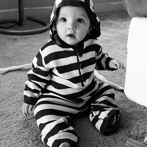
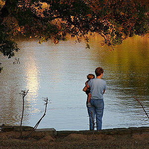
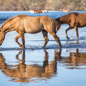
I've fallen in love with her work since the first time I stumbled across it! I don't want to categorize her photography as 'dreamy' because the 'dreamy' look isn't something I'm a fan of. Plus when I think of 'the dreamy look' I think, very out of focus and unreal in my opinion. When I look at her work her subjects are very clear and natural to me, I guess what appeals to me is the softness, colors and the DOF.
I know this look can also be achieved by using film and 400h, and I've considered switching to a 35mm or medium format for that very reason.
Some other info I know about this photographer is that she shoots with a Canon 5d mark ii with 85mm 1.2, 50mm 1.2 and 70-200mm lenses. Also a contax 645 with 80mm lens. I feel like her photos are very consistent even though she uses both film and digital.
So with all this said how does she do it? I've tried to replicate this look a number of times, by either going down 1-2 stops or editing in LR3. But it doesn't turn out. I know there are probably some LR3 presets out on the web but I'm not really interested in using a bunch of presets, I want my editing to have my own style to it. Do you think she achieves this with the help of the glass she's shooting with?
Anyways, here's the link to her website...tell me what you think!
KT Merry Photography.
Thanks
Last edited:
")