What's new

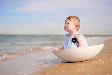
Cheeky muppet on the beach...

janineh

TPF Noob!
Joined
Jul 2, 2012
Messages
363
Reaction score
73
Location
Melbourne / AUS
Took my daughter to the beach this morning and thought I share this photo I took. C&C welcome.
 

Attachments

  • $L1sm.webp
    $L1sm.webp
    531.5 KB · Views: 200
Cute. Bit of a halo around the kid... did you darken up the sky?

That horizon is majorly tilted. I like how she's looking upwards as a result, but... it's REALLY bad.
 
Cute. Bit of a halo around the kid... did you darken up the sky?

That horizon is majorly tilted. I like how she's looking upwards as a result, but... it's REALLY bad.

Thanks for the input. I have lightened her face, thats how the halo happened. I will fix this up.
I have straightened the horizon as you disliked it. What do you think? I think still prefer my old version, as Luca is straight, which seems a bit more important. But maybe I am wrong. $Hannah (1 of 1)-86 copysm.webp
 
The aura around the face is gone, which is good. Horizon still looks tilted to me, but it may be an optical illiusion... I do think it's better though.

I am a huge picture tilter guy, but with something as obvious as a horizon I'm always anal about keeping it straight.
 
I like the non-tilted version better. The horizon may not be as big of a deal to non-photographers, but here it's just hard to look past a glaring technical issue such as that.
 
Rotanimod said:
I like the non-tilted version better. The horizon may not be as big of a deal to non-photographers, but here it's just hard to look past a glaring technical issue such as that.

I understand what your are saying, I usually wouldn't think it is exeptable to have such a tilt. But I do think the pic works better that way her being straight.
 
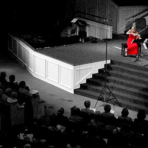
Thats a pic of fellow photographer and he got great critique from all his fellow photographers for it. Now tell me, is that any different to mine with the horizon?
 

Attachments

  • $image-381047313.webp
    $image-381047313.webp
    44.2 KB · Views: 179
HA! i like it, the original sans halo. i'm not one to mind horizons, and i agree that the subject is of most importance. although i think my opinion is a minority when it comes to photographers, but i really don't know why since i the vast majority of the general public wouldn't mind such a minor detail so long as the subject makes sense. i think sometimes as photographers we rely more on technical details and lose track of what makes aesthetic sense. as far as cc, i like the composition and exposure, but maybe could have gotten a better expression. still super cute as-is though, you got a nice looking chunk there.

 
Last edited:
The tilted horizon actually gives me the impression of movement and is much more dramatic, "oh sh!t, that babe is gonna get swept out to sea!" versus the straight horizon that looks like a baby sitting in a bowl.
 
That is a FANTASTIC picture that happens to be tilted and needs to be fixed.

Again, I'm the crown prince of tilting around here. I 1> think it's perfectly acceptable, and 2> do it all the time. However, there are tilts that look like purposeful choices and tilts that look like oversights and errors, and to date I have never seen one tilted horizon that looked like a purposeful choice, and it ALWAYS makes it look like there's something wrong with the photo.
 
I am for the first photo, the tilted one looks like she is about to slip in to the Aussie Sea.
 

Create an account or login to comment

You must be a member in order to leave a comment

Create account

Create an account on our community. It's easy!

Log in

Already have an account? Log in here.

New Topics

Back
Top Bottom