bwlergh
TPF Noob!
- Joined
- Sep 12, 2008
- Messages
- 98
- Reaction score
- 0
- Location
- Sydney, Australia
- Can others edit my Photos
- Photos NOT OK to edit
First rough edit I did after I got home after the shoot.
1. I know the Man in the red shirt is there We thought he left and just as I took the picture, he reappeared again.
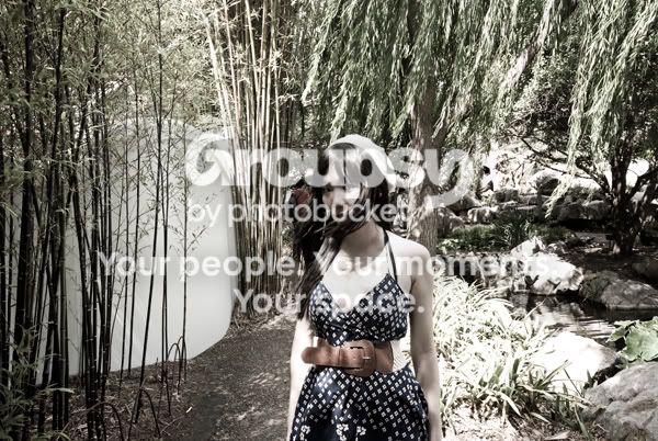
2.

3.

1. I know the Man in the red shirt is there
We thought he left and just as I took the picture, he reappeared again.
2.
3.

 .
.


![[No title]](/data/xfmg/thumbnail/37/37658-89245697846ece2c4ecbce304510699b.jpg?1734170813)
![[No title]](/data/xfmg/thumbnail/35/35265-c9ea3efd2c618a57ea136e63ad106880.jpg?1734166927)