DGMPhotography
Been spending a lot of time on here!
- Joined
- Mar 23, 2012
- Messages
- 3,160
- Reaction score
- 718
- Can others edit my Photos
- Photos OK to edit
Hey guys:
Here's a photo I made from a recent shoot with Juliana. It was inspired by a pop art image of Marilyn Monroe.
Please note the word inspired. It's not supposed to be an exact replica. But I'd like your thoughts on the execution and color scheme.

This is the original version, using the color scheme from the reference.
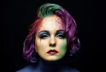
This is a desaturated version. Juliana's feedback was that she thought the original version was a LGBT pride image, which was not my intention, so this version is less vibrant.
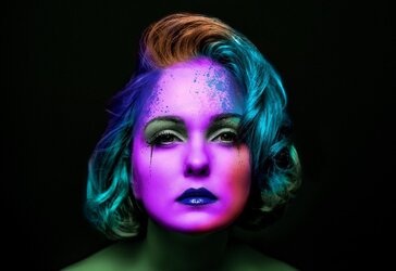
And here is just a different color scheme all together.
Thoughts please, and thank you!
Edit:
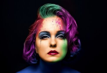
Here is a compromise. I've brightened the eyes, tweaked some of the colors and desaturated just a little. Thoughts?

Here's a photo I made from a recent shoot with Juliana. It was inspired by a pop art image of Marilyn Monroe.
Please note the word inspired. It's not supposed to be an exact replica. But I'd like your thoughts on the execution and color scheme.

This is the original version, using the color scheme from the reference.

This is a desaturated version. Juliana's feedback was that she thought the original version was a LGBT pride image, which was not my intention, so this version is less vibrant.

And here is just a different color scheme all together.
Thoughts please, and thank you!
Edit:
Here is a compromise. I've brightened the eyes, tweaked some of the colors and desaturated just a little. Thoughts?

Last edited:


![[No title]](/data/xfmg/thumbnail/37/37605-90c8efaef5b7d1f52d4bf8e7dfd33673.jpg?1619738148)
![[No title]](/data/xfmg/thumbnail/39/39292-4169a355b794ae9735845c4ad45d06ff.jpg?1619738958)
![[No title]](/data/xfmg/thumbnail/39/39291-a89dc472765e04f66f617dd9acc8030d.jpg?1619738958)
![[No title]](/data/xfmg/thumbnail/31/31744-f06a1a9bb9c74e3b8b332878f5fe71f1.jpg?1619734986)
![[No title]](/data/xfmg/thumbnail/35/35946-771bfce9b2727c9126587d96c471da80.jpg?1619737254)
