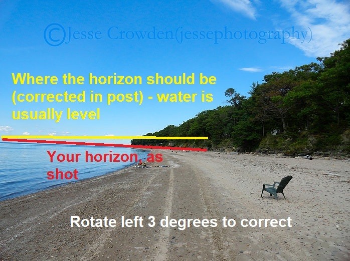
jessecrowdenphotography
TPF Noob!
- Joined
- Oct 10, 2017
- Messages
- 37
- Reaction score
- 8
- Can others edit my Photos
- Photos NOT OK to edit
This site features a variety of parks and woods in Western NY as well as the erie county fair and botanical gardens
Jesse Crowden Photography
Jesse Crowden Photography
![[No title]](/data/xfmg/thumbnail/35/35870-e324e80cd11d99176357e12cd2ba3b8a.jpg?1619737196)


![[No title]](/data/xfmg/thumbnail/35/35869-2e4166624c383d0d2dec81e5b0f6e5dd.jpg?1619737196)