This site features a variety of parks and woods in Western NY as well as the erie county fair and botanical gardens

Jesse Crowden Photography

Ayeee a local! Going to check it out now!

You happen to have IG?
Im thinking about making one for the site and maybe even a youtube channel for it
Im a nursing student too so I am limited on when I can get things done but i try to juggle it all in.
 
Awesome man! I live in Batavia and I’m a paramedic. I’m also applying to PA school, so I feel your pain man.
 
A few thoughts for possible improvement:

1. Your 'About' page should at least have a level horizon, even if you're not going to show people what you actually look like;

2. No need to have two identical menus;

3. Your sub-menu font colour is difficult to read in some situations; and

4. Consider reducing the number of galleries and grouping by category to a maximum of 4-5 galleries and 10-20 images per.
very nice website. for right now im just trying to get my work out there and I'm limited to what i can do with my website because I'm not paying for anything since im a college student and money is a little tight at the moment. I can take a look at the sub-menu again, i knew it was tough to see sometimes but they have limited options so thats why i made the left one as well and different ways of getting to the areas whether by clicking on image galleries itself or using the feed, thank you for your input
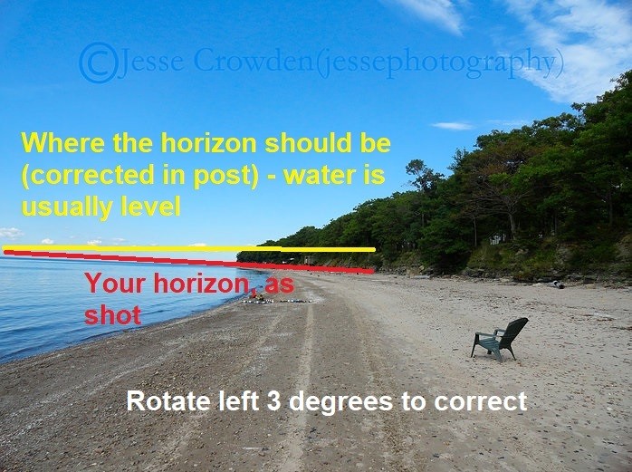
btw what do you mean by level horizon
 
Horizon.jpg
 

Most reactions

New Topics

Back
Top