Composition question (Commodore Barry Bridge, Chester, PA)

Febs

TPF Noob!
Joined
May 25, 2013
Messages
10
Reaction score
5
Location
Philadelphia, PA
Can others edit my Photos
Photos OK to edit
Hi folks-

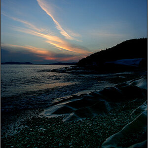
I've been reading these forums for some time, but this is my first post, and I have what is probably a fairly basic question regarding composition and placement of the horizon line.

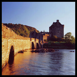
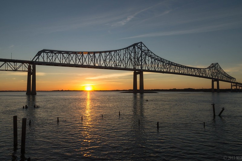
I am attaching two similar photos, taken a few minutes apart, of sunrise at the Commodore Barry Bridge in Chester, PA.

In photo #1, I've tried to apply the rule of thirds with respect to the horizon line and placed the horizon line approximately 1/3 from the bottom of the image.

In photo #2, the horizon line is roughly in the center of the image. I know that this is generally considered to be undesirable, but in this particular case, I feel like the bridge on the top part of the photo and the posts in the water in the bottom half of the photo (each of which are roughly on the rule-of-thirds lines) provide balance. Does this work for this particular image? Am I at least asking myself the right questions? I would appreciate any input on this question, or any other C&C anyone might have of these images.

Thanks,
Mike


1.


9708752563_4d82163886_c.jpg

Commodore Barry Bridge

2.

9736494382_03050a3f79_c.jpg

Commodore Barry Bridge at Sunrise
 
In #2 the horizon line is not exactly in the vertical middle, and the extra water at the bottom becomes a "ground" which helps. The slightly wider angle also helps.

#1 has more orange in the sky which also helps, IMO. Both are quite nice.

So there.
 
First off, the horizon is actually a bit crooked, which is throwing me off a bit. If I look past that, then I actually prefer the second photo, because of the objects in the foreground and the position of the top of the bridge.
 
In #2 the horizon line is not exactly in the vertical middle, and the extra water at the bottom becomes a "ground" which helps. The slightly wider angle also helps.

#1 has more orange in the sky which also helps, IMO. Both are quite nice.

Thank you. I prefer the wider angle of #2 as well. That was taken at the 18 mm end of my 18-135mm lens (27mm equivalent on my A57). A wide angle lens in the 10-20mm range is high on my wish list.
 
The guideline of thirds isn't going to always matter. At least, it doesn't to me. Both of these photos look pretty good to me.
 
The "mistake" was in putting the background element rather than the subject on the 1/3 line. I say mistake even though it's not a mistake... just the the "rule" of thirds is usually applied to foreground object in priority to background objects.

If you crop the second one, putting the bridge rather than the horizon more or less on the 1/3 line, I think you'll find it works quite well.

You'll have a nonstandard extra wide 3:1 or 4:1 aspect ratio, but for a print that gets a nice frame over a fireplace or in a long hall way, it would still work quite well.
 
The water is more interesting than the sky here. You should have gone for 1/3 sky, 2/3 water, if anything. This also increases the drama of the bridge, making it feel more "above, towering" than the other way around does.

I'm pretty sure this is why the second one reads more pleasing.
 
The water is more interesting than the sky here. You should have gone for 1/3 sky, 2/3 water, if anything. This also increases the drama of the bridge, making it feel more "above, towering" than the other way around does.

I'm pretty sure this is why the second one reads more pleasing.

Interesting yes, pleasing not so much.

If I were going to print and frame this particular shot, I'd probably be looking for the beauty aspect rather than the urban decay aspect. I might also try rotating it slightly counter clockwise to emphasize the vanishing point of the lines.
 
The thing with bridges such as yours is that psycologically we want it to be light but stable and solid, a lot of sky above it and low horizon negate this perception. If you trim 1 or even 2 cm from above of your 2nd image, it will look even more balanced. Rule of thirds is just a basic rule but you need to consider the subject and the overall visual weight balance.
 
Agree about the second one. To me balance is much more important than the "rule" of thirds. Most composition books for artists don't even mention ROT. The second could also work with a little off the top, as suggested.

BTW, best picture of the Commodore Barry I've ever seen.:D
 
Thanks, everyone. I appreciate all of your comments and suggestions! When I get home from work I plan to spend some time in Lightroom exploring the specific suggestions that you have each made.
 
As mentioned there are other aspects to composition besides placing something a third of the way from the edge of the frame. I think the second photo works better because the posts aren't so close to the edge of the frame (the scene doesn't seem as cut off as it does in the first) and the balance overall seems better. Both are good photos, I think the second one's even better.

There is a good bit to composition; if you search elements of composition in art (instead of photography) you should find links to sites that have info. about using line, space, texture, space, color/tone etc. to create a balanced composition.

(edit - I'd maybe crop the top edge of the second one a little, as there might be more space (sky) there than you need. That one is probably less orange because the sun appears a little lower on the horizon - I might brighten it slightly but that's about it. If you're going to edit I would try not to overdo it (don't mess up a good thing!) and make copies to work on if you don't do that already.)

With these photos your eyes seem to have told you what worked best more than the so-called rule did!
 
Last edited:
For me the composition in these pictures are a contradiction. The bridge and the sunset are competing to be the subject. Neither one wins. The bridge is also a leading line. Problem is that the line does not lead to anything. Regardless of where you put the horizon it will always seem off for these reasons. I don't mean to hurt any feelings but I believe the only way to improve is with complete honesty. That's how I like people to critique my shots at least. I hope this helps.
 

Most reactions

New Topics

Back
Top