What's new

Corporate Power Portraits

OLaA

No longer a newbie, moving up!
Joined
Aug 5, 2012
Messages
259
Reaction score
48
Location
Sacramento, CA
Can others edit my Photos
Photos NOT OK to edit
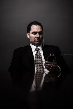
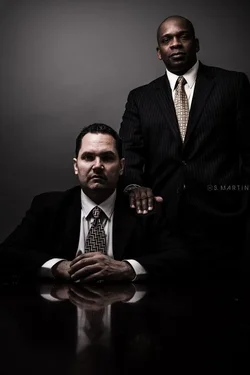
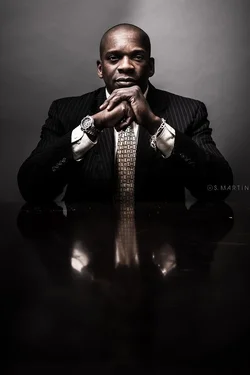
Finished a corporate shoot recently. A bit more dramatic than you would typically find, but they wanted something to use for featured articles, and conveyed power or strength. This is what I came up with. CC welcome!

More photos at Our Life as Art
$IMG_0427.webp
$IMG_0432.webp
$IMG_0433.webp
 
Interesting; definitely not the usual corportate headshots. The first and third seem very strong, but I have to say, I don't really get 'power' from the fellow listening to his MP3 player.
 
The first one would be better if the table wasn't dead center height-wise.

The second one just makes no sense.

The last one give all power to the guy standing and takes all power from the guy sitting.
 
They're a bit dark but I suspect that was your intent. Not sure about #2, looking at his phone(?) he's not engaging with the viewer, in fact, it suggests (to me) the viewer is being ignored in favour of his gadget. The others I like but I'd clean up the crumbs(?) on the desk, particularly in #1. Overall I like #1 best. :)
 
Agreed the Ipod says "I'm distracted" and conveys no sense of power. Mostly conveys "i'm a teenager" which I doubt any corporation would want portrayed...
 
Thanks for the comments. I agree with everything said so far. Especially the suggestion from the hand placed on the shoulder in the third photo. The second and the third photo were both requested positions. He wanted to be on his headset because as he said that is his usual look and wanted to convey that. Probably would have been better options had I took the time. And the third was a choice between two poses they liked, the second being back to back which I refused to do haha.
 
I like #1 and #3. I would clean up the spots on the table in #1, and the little spot in #3. I am not feeling #2.
 
I like #1 and #3. I would clean up the spots on the table in #1, and the little spot in #3. I am not feeling #2.

I went back and cleaned up all the spots. Can't believe I didn't catch it the first time around. Wasn't being as critical as I thought. Almost a little embarrassing but that's why CC is so beneficial!
 
I'm guessing these guys are wearing signature suits (read $$$$) or want to present themselves as such. There is a lack of detail missing. Perhaps you can bring that out in post a tad.

#3 is a miss if they are equals within the firm.

#1 is powerful, but again the suit comment.

Thanks for sharing.
 
I'm guessing these guys are wearing signature suits (read $$$$) or want to present themselves as such. There is a lack of detail missing. Perhaps you can bring that out in post a tad.

#3 is a miss if they are equals within the firm.

#1 is powerful, but again the suit comment.

Thanks for sharing.

Great feedback. I don't think bringing out the suits and cut would work for the particular look I was going for. The darkness of the shot would be lost by trying to bring it out I believe. I have a nice custom preset saved for bringing out texture and detail in clothing but again wouldn't have mattered here. But something I'll keep in mind for future compositions. Thanks!
 
The first one would be better if the table wasn't dead center height-wise.

The second one just makes no sense.

The last one give all power to the guy standing and takes all power from the guy sitting.

agree with all these points
 
Great feedback. I don't think bringing out the suits and cut would work for the particular look I was going for. The darkness of the shot would be lost by trying to bring it out I believe. I have a nice custom preset saved for bringing out texture and detail in clothing but again wouldn't have mattered here. But something I'll keep in mind for future compositions. Thanks!

I don't think the ideas are mutually exclusive.
 
Beautiful images. I think the fact they are dark works well.
 
Great feedback. I don't think bringing out the suits and cut would work for the particular look I was going for. The darkness of the shot would be lost by trying to bring it out I believe. I have a nice custom preset saved for bringing out texture and detail in clothing but again wouldn't have mattered here. But something I'll keep in mind for future compositions. Thanks!

I don't think the ideas are mutually exclusive.

Maybe I'm not totally understand your direction, or my work in post is lacking? In either case I would love to see an example if you ever have the time. Thanks again.

Beautiful images. I think the fact they are dark works well.

Thank you!
 
1 is my fav. Very strong shot indeed. 2 is cheesy. Im with TI and dont really get power here. 3 is okay but the hand on the shoulder looks effeminate. Have him hold the lapel of his jacket instead or try a shot with both of them standing side by side.

Love the processing though. I think its spot on for the concept here.
 

Create an account or login to comment

You must be a member in order to leave a comment

Create account

Create an account on our community. It's easy!

Log in

Already have an account? Log in here.

Back
Top Bottom