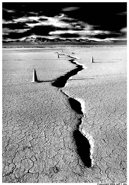
I really like this picture because of the contrast, however...i think the mountains in the background distract me a little, i would have concentrated my efforts more on the crease than the very far distance...
I disagree about the mountains. This photos starts in the foreground, and leads your eyes along the crack eventually to the background with the mountains and sky, which I think are stunning. This is a great photo. Nice work
The crease should lead SOMEWHERE, and not into nothingness, like the edge of a cropped photo. So I sure would want the mountains to stay.
I, however, feel that with the stunning sky (!) there are two themes in the photo which overload it. It can be either the crack from its very close beginning up until the mountains (cropped sky), or less of the crack, especially not the very clear, very near foreground, maybe from the first cone upwards, and all of the mountains and the sky.
Other than that, though, this photo fascinates me, mostly so because of its very hard contrasts which I like A LOT in this one. The extremely long shadows of the cones add to this effect. WOW.
I love the contrasty look to this one as well. The sky might be a tad too dark though...it draws away from the mountains in my eye. Also, I'd be curious as to what kind of post work you did to achieve this look. It's like a weird version of IR almost.
Hello everyone, thanks for looking at my pic. My process for my photos is all done in Photoshop, I don't use any filters because I like to start with a "raw" image. You can see a description of my process here:
I have to say that the two photos you used as examples on your process page looked much better in my opinion before your processing. Sometimes you can do too much in PS. I thought the color and composition in those originals was beautiful.
You really think so? To me, the color versions are pretty devoid of emotion, but I do take everything in color, just in case. The black and white is a reflection of how I felt at the time I took the shots (usually in extreme weather conditions) and the general dirty/grittyness of the locations.
Very nice photo, the contrast is very nice, specially because it differs from the mountain and cloud contrast, the only thing bothering me is that the "fluidity" of the picture is cut by the droped cones almost at the end. Overall I feel the theme of this picture to be something about automobiles, lol that´s just what I feel.. kudos.
Hey Jeff just looked at your site you have some nice work. You seem very interested in a tachtile quality to the work, but I have to say that I think you loose a lot by punching up the contrast so much. I think its a good first hit but I really think that with a longer tonal scale you will actually enhance the textural quality to the work. Give it a try sometime

")

![[No title]](/data/xfmg/thumbnail/31/31016-072880d9bc086c9fe71b9b1ae48603d4.jpg?1619734571)
![[No title]](/data/xfmg/thumbnail/32/32170-3fce4409fbea1f5e9818209c7e87c1ea.jpg?1619735234)