ArmyofJuan
TPF Noob!
- Joined
- Dec 17, 2012
- Messages
- 12
- Reaction score
- 2
- Location
- New york
- Can others edit my Photos
- Photos OK to edit
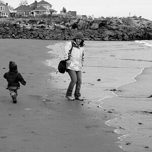
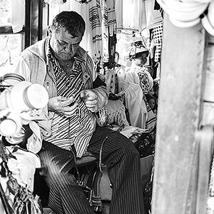
Just wanna get some critique from the photo forum community. I'm not a professional and photography is a bobbie and just wanna see if i can get some pointers to improve my skills. These images are not edited and all were taken handheld with a Canon T4I with a 40mm F2.8 pancake lens. pretty much all were at an event what Improve NYC does around the city at times. first 2 were taken at the MP# experiment in July. The last one is a Yoga session in Time square. Any pointers are welcome and critique is much appreciated. Thanks in advance.
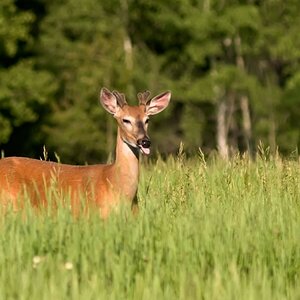
 1/2500 F3.2 iso -100
 1/2500 F2.8 ISO-100
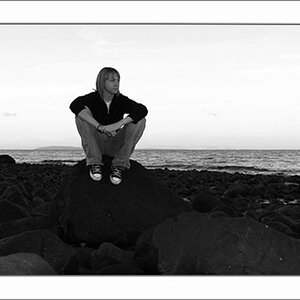
 1/320 F2.8 ISO-100
1/2500 F3.2 iso -100 1/2500 F2.8 ISO-1001/320 F2.8 ISO-100")

![[No title]](/data/xfmg/thumbnail/31/31980-e5048a424621c7b3cd0d306d63c09d67.jpg?1619735137)
![[No title]](/data/xfmg/thumbnail/31/31977-2b717e032201241cbeae8226af23eba4.jpg?1619735136)