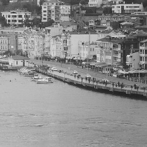
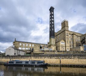
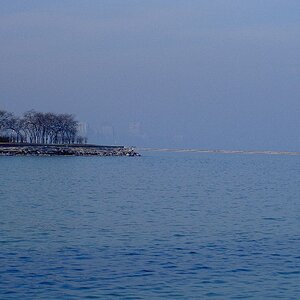
The second shot is sweet. I'd crop enough from the top to ease the bull's-eye placement of the wall and buildings--the shot's dominant elements whose impact would be enhanced. Might a bit of perspective-control work in the far right corner of the building? Any chance of cloning-out the(distracting) clutter under the distant bridge on the left? Weren't it for the stack's lettering, a 180 horizontal flip would pull the eye into the shot as it follows the sweep of the bank. As is my eye hits dead centre first and stays there.
I see the first shot as a warm-up for the far better second one.
Purely my taste but I'd experiment with a monochrome version of the second shot. Curious if a red filter effect would lend some drama to the sky and water? Playing with contrast alone would open the way to another "look." You deserve more comment here than a cursory "nice shot."
Thank you for your valuable input, I'm struggling with landscapes. I will attempt to incorporate the things you have suggested. I may also struggle with the techniques in achieving the same..regards, Mick
The second one is just a superior image overall. I always aim to have a close to replication of what I seen when I was there so the editing here mostly looks quite fine to me. I'd crop a fair bit from the top, I think that will turn it into quite a decent image actually.
I'd also like to see the sky lightened up a touch, and the temp in the sky increased a little. Apart from that and the crop, I reckon you've done well.
The first is quite fine, just it doesn't have the same impact as the second.
@mikbone While we want you to feel free to post for serious critique in C&C Gallery, there are some hard rules you must follow for posting.
1) After you post your photo, please provide as much technical detail as you have. Your camera, your lens, even shutter speed and aperture, plus whatever editing program used. For our analog users, include your film type and development process. *NOTE - now that TPF includes this information when available, you do not need to post it unless you post and image without metadata included.
2) In a sentence or two, please let us know what you were trying to achieve with your shot. Letting us know why you took the shot helps us understand your creative thought process, which will inform how someone might respond.
3) Keep your skin thick in here. People who may come across as blunt are not necessarily trying to be insulting. Don't expect flowers to be tossed your way; that's not what this is about.
To those who are offering C&C:
1) While the poster may not be expecting flowers to be tossed, this isn't the place or time to throw bricks, either. Being straightforward in critical observations can be done without being condescending.
2) Pay close attention to both the artistic thought process as well as the technical methods given.
3) No "Nice shot!" comments here - if you honestly have nothing more in depth to offer, just take a pass here.
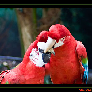
4) Please limit each post to one image for discussion, unless a second is needed for illustration.
Please edit your post to comply with the rules of the gallery, or if you prefer it can be moved to one of the other galleries that aren't as restrictive.


![[No title]](/data/xfmg/thumbnail/31/31709-79016edd1a9f5ea41ef60f546bd0236d.jpg?1619734965)