As you can see, I moved your photos from the General Critical Analysis over into the General Gallery.
The General Critical Analysis is actually meant to be quite considerably different from our Galleries (though unfortunately in fact it is not because no one stops to read the special guidelines for that one forum!), so that ONE photo gets posted for more than just comments on "I like the first but not the second" but a sort of deeper critiquing where you have to think up your reply carefully and explain why you critisise this positively and that negatively.
You happen to be the newbie to whom I am explaining this all, but it is less personal than it might feel to you, you just happen to be the one whose thread I'm using to point it out once again. Maybe my comment is being read and more maybe even followed by more (and this is much more directed to the longer-standing members than our newcomers).
That said and out of the way, and the welcome stated, let me turn towards your three photos here submitted for comments or even critical comments.
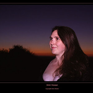
The first is nicely done, it has an interesting perspective (should you find the abbreviation POV on the forum, then be told that that stands for "point of view"), a pleasing composition, quite symmetrical with the starter ball and cue adding an out-of-symmetry element to it which increases the tension within the balance of your composition (further increased by the diagonal line the cue adds). So - yes. Well done!
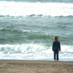
For the photo of the flower in the hanging basket I feel you had better got out the ladder to get yourself up there. As it is, it looks like a "quick snap" of the flowers, just to document what they looked like. But POV and composition don't look very thought-over, and you cropped into the top flower's petal. Not so good.
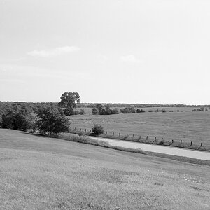
The third is divided into two almost equal halves by the horizon, half sky, half ground ... in landscape photography this division in halves with a centered horizon is not regarded highly ... you will find out that images (paintings, drawings, canvasses, photos, whatever) look better when the horizon line is placed either on the border to the upper third of the frame or that of the lower third. The viewer gets captured more, for a slight dis-balance makes the picture more interesting.
What I do like about your photo here is the snaking line of the little river in the grass. But if I were suggest a post-taking composition (by cropping with software), I would go "landscape" (horizontal frame), crop off MOST of the sky, almost all of it, really, and the ground so much that he river would begin in the bottom right corner of the new frame. Just an idea... and my idea ... critiquing is always subjective.
Thanks for all the advice!, ill make sure i only put one photo up here from now on These are a couple pictures from when i was 13 and then the 2007 one i took with my dad's Digitial Canon Rebel XT. I have been taking photography classes at my highschool with Tri-X film developing those in a Dark room using my 23 year old Canon, i'll post some of those when i get the chance.


 .
.


![[No title]](/data/xfmg/thumbnail/32/32156-d6cfe2865ceed861a0633752a006ea20.jpg?1619735234)