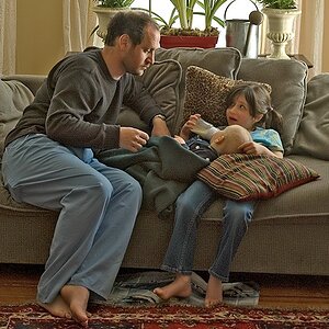
Crystal picks

craig

TPF Noob!
Joined
Oct 30, 2003
Messages
5,600
Reaction score
21
Location
Hermosa Beach, CA U.S.A
Website
craigblank.com
This is my favorite 3 of the 17 final client picks. I think this shoot turned out well. Let me know your thoughts.

Love & Bass


20080725dsc0047wt2.jpg


20080725dsc0080pv1.jpg


20080725dsc0163eu2.jpg
 
Since I don't know what "look" you're going for, I won't comment on the poses/expressions, but I am a little concerned about the lighting, especially in #1. There's a very hard shadow line that runs around her neck/clavicle, and the highlights on her hair, image right, seem just a little bright to me. It's a pity that her fingertips are cropped.

That said, I very much like the series and think they turned out well.
 
Thanks for the comment! We are going for the craig stylish lighting look. Please comment on the poses. I question the shadow in the first frame as well, but only for a moment. I am thinking of trying full contrast and maybe B&W.

)'(
 
It's not that I don't like the poses, I do. In fact to me they're very Varas-esque. It's just that her expressions don't seem to work with them, appearing rather "harsh". I like the poses, I like the expressions, but the combination isn't working for me...
 
i agree, the lighting in 1 makes her look too rough and quite frankly, a little old. in i really like the second one and 3 is great, but i would like to see all of her dress.
 
Except for the shadow on her neck/chest, I think the lighting in #1 is perfectly fine. What concerns me is the retouch (that long line from her nose down past her mouth needs dealing with), and the compression halos in the background.

The pose in #2 is solid. I'd like to see a little less red in her skin.

#3 didn't work. It's all in the head. You have tall posture and long lines, but the head angled down breaks the flow and clashes. I also don't like the pursed lips.

All in all, not bad.
 

Most reactions

New Topics

Back
Top