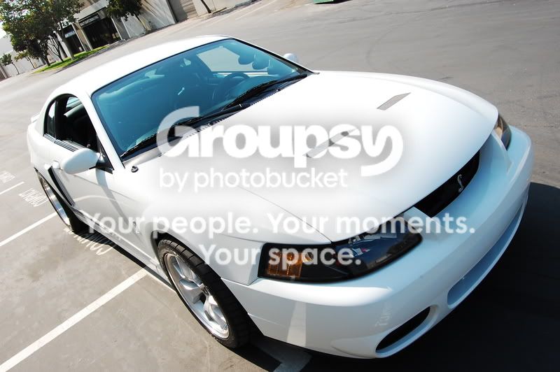
The main comment I have to offer about these images is the lack of contrast between the car and the surroundings. Given that the car is "bright white", it would have made a much bolder statement were it shot against a green forest background, or some other rich tone. The rather bland neutral tones rob the images of some of the visual impact they should have.
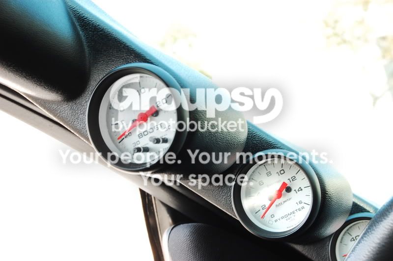
The 'A' pillar gauges need a little work; there are some distracting reflections on the gauge face, as well as fain shadows through the windshield.
When shooting text, such as in the last image, try and frame it so that the begining is closest to the eye; our brain is used to reading left to right, near to far, so it seems a bit odd when you have to "look" far away for the start of a word.
Overall, nice work.

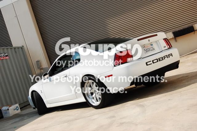
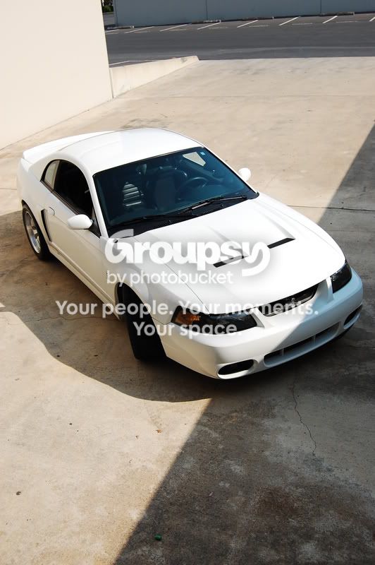
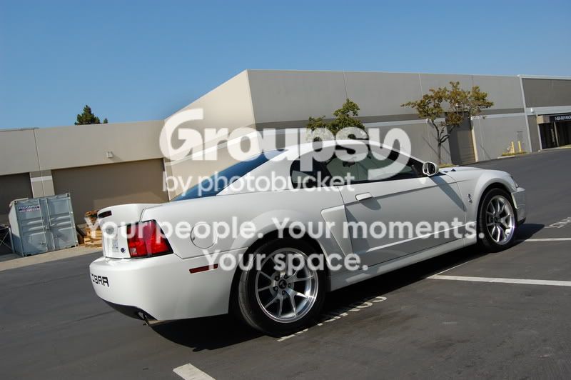
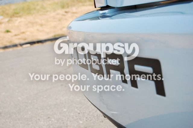


 I'm not an American car guy, but you gotta love a Mustang Cobra. It's just too cool.


![[No title]](/data/xfmg/thumbnail/37/37092-c446ffb89610a57384a51ac5254beffd.jpg?1734169827)

![[No title]](/data/xfmg/thumbnail/41/41890-a5975e67f00dd9340fcf9dba8728a762.jpg?1734176243)

![[No title]](/data/xfmg/thumbnail/36/36395-66eaff4565ecf4245f13a9c469a9273b.jpg?1734168775)
![[No title]](/data/xfmg/thumbnail/32/32155-5dfb2c8aee58498ba1862d4f34389669.jpg?1734161045)
![[No title]](/data/xfmg/thumbnail/32/32153-05f63098d8752b05df53dfa6ae8d6e7d.jpg?1734161045)