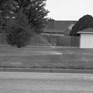
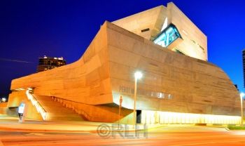
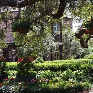
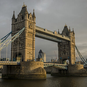
Composition: Good. The bottom one is a good framing of the subject itself, but it also has an awful lot of distracting streetlights and that fence on the right, as well as the lights of the buildings behind that all seem to distract without contributing artistically. It makes it look more like a hasty snapshot because of this. It looks like you could have taken the photo right on the farther side of the iron fence and eliminated most of these problems (traffic lights would be behind you or off to the left, the building lights would be hidden by your subject, etc.). The top one looks fine.
Color: The top one seems good. The bottom one seems way too red.
Exposure: Top photo is a bit underexposed. You have room in the highlights to expose more, and you should, because the shadows in your trees have lost all their detail. Not very far off though. Maybe +2/3? The bottom one has majorly blown out highlights (all the solid white glare reflections from lights). This is a major no no. Should expose this lower if you have no other options to at least capture all the detail in the building at the expense of the sky.
Sharpness: Focus itself in the center is okay, but in the top image,you are losing a lot of sharpness at the edges. Probably you were shooting wide open at 18mm would be my guess. This is inadvisable with a kit lens. Even the best of lenses wide open at the extremes of their zoom will be soft. Stop down a little bit and/or stay nearer the middle of your zoom range if you need to shoot wide open, and it will be sharper. On the bottom image, probably some combination of things is making the entire image soft. hard to say exactly what would be the biggest culprit without exif data.
In general, it is helpful if you post images with their EXIF data intact so that your focal lengths, exposure, etc. can be noted.
Where were you standing in the top photo?






![[No title]](/data/xfmg/thumbnail/41/41493-60071420f928565170996b4edc3de2f0.jpg?1734175887)