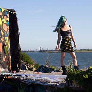
Last week I posted a portrait of Dawn and received some suggestions that my stark white background was too distracting. Now I have a bit of time I've been working (new photo) on the basic tips that I was given (thanks to The Traveler in particular). C&C on how I did at this will be very welcome.

I think the red background is very distracting. Just kidding! I like the color you chose for the background. If I'm being honest, my eye is immediately drawn to the white halo around her. I think you were maybe going for a pinup type of vintage feel? I don't know that I could do this, so take it for what is worth. I would maybe try to make a circular gradient behind her, almost as if you had a strobe pointed at a pink background immediately behind her so you get a circular white halo that gradually falls off to pink at the edges. If I couldn't do that, I might try a white to pink gradient from bottom to top? Or lastly, go for a solid background? I'm just distracted by the white following her shape all the way around. Again, I'm not trying to beat you up. That's just one man's opinion. Merry Christmas to you and yours!