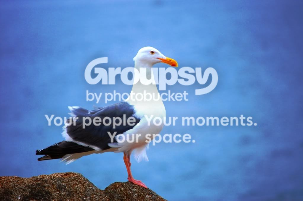
The highlights in the first photo are blown out, and the composition is pretty, well, square. It doesn't lead the eye anywhere. It's not necessarily a bad thing, but if you would have moved the seagull over to the left, with more space to the right of the image, it might have made a more interesting image in my opinion. The colors are nice, though. The wight balance seems to be correct for the most part.
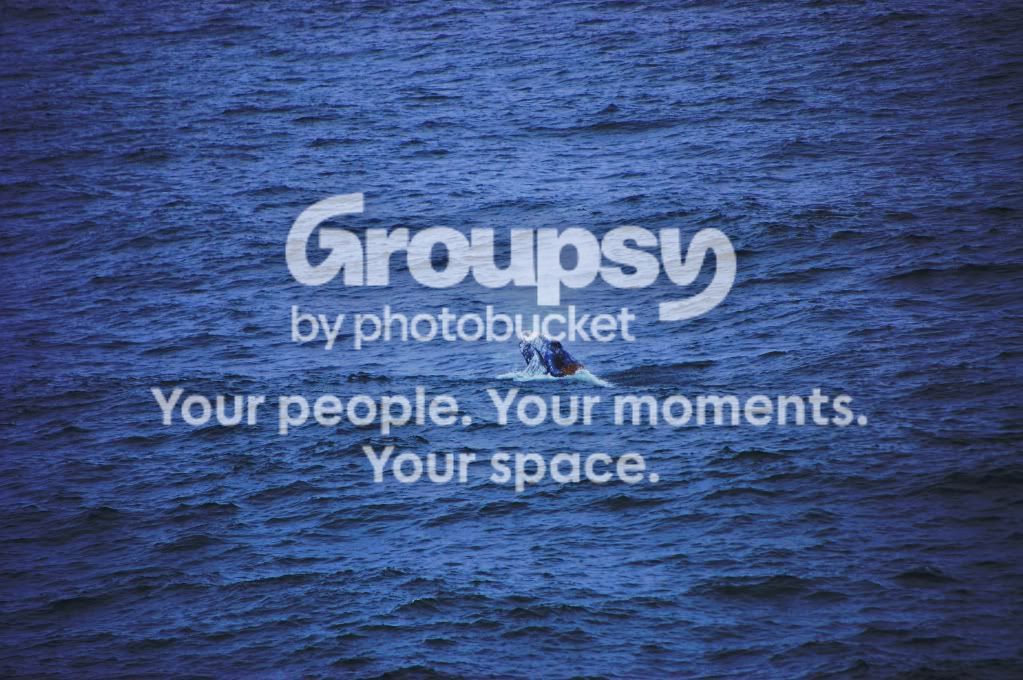
The second one, I'm just not feeling it.
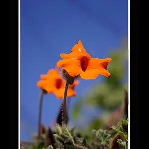
The subject is too small in the frame, and the vignette is too harsh for my liking.



![[No title]](/data/xfmg/thumbnail/41/41797-ed370d68dae70f5b0a7252ec2d525912.jpg?1734176109)
![[No title]](/data/xfmg/thumbnail/37/37280-a7e70a01ccd331918e71645cd4c1f16e.jpg?1734170137)
![[No title]](/data/xfmg/thumbnail/38/38731-d96a4449258a238d3de11f3c4adffc36.jpg?1734172599)