C&C per req: They're a start, but definitely with room for improvement.
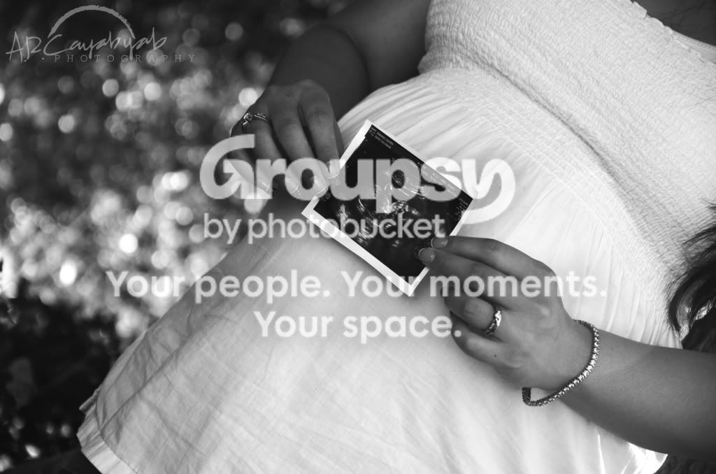
1. NOT a fan of the angle, but that's a personal taste. This one had potential, but you didn't quite get the crop right IMO. You've got some hair image right which looks out of place, and a lot of empty space image left. The whites in the shirt are pretty good, but I think this one should be left in colour to provide a contrast with the US image.
2. Miss Cream nailed this one.
3. The whites in her top are almost totally blown and your DoF is too shallow; the shoes are soft. The difference between an okay picture and a great photograph is often the background. In this image the background is wayyyyyyyy too busy and distracting. Go for something soft, monotone and with little or no apparent detail (green hedge?).
4. Blown highlights; REALLY blown highlights. Vinyl siding is NOT a photographic background!
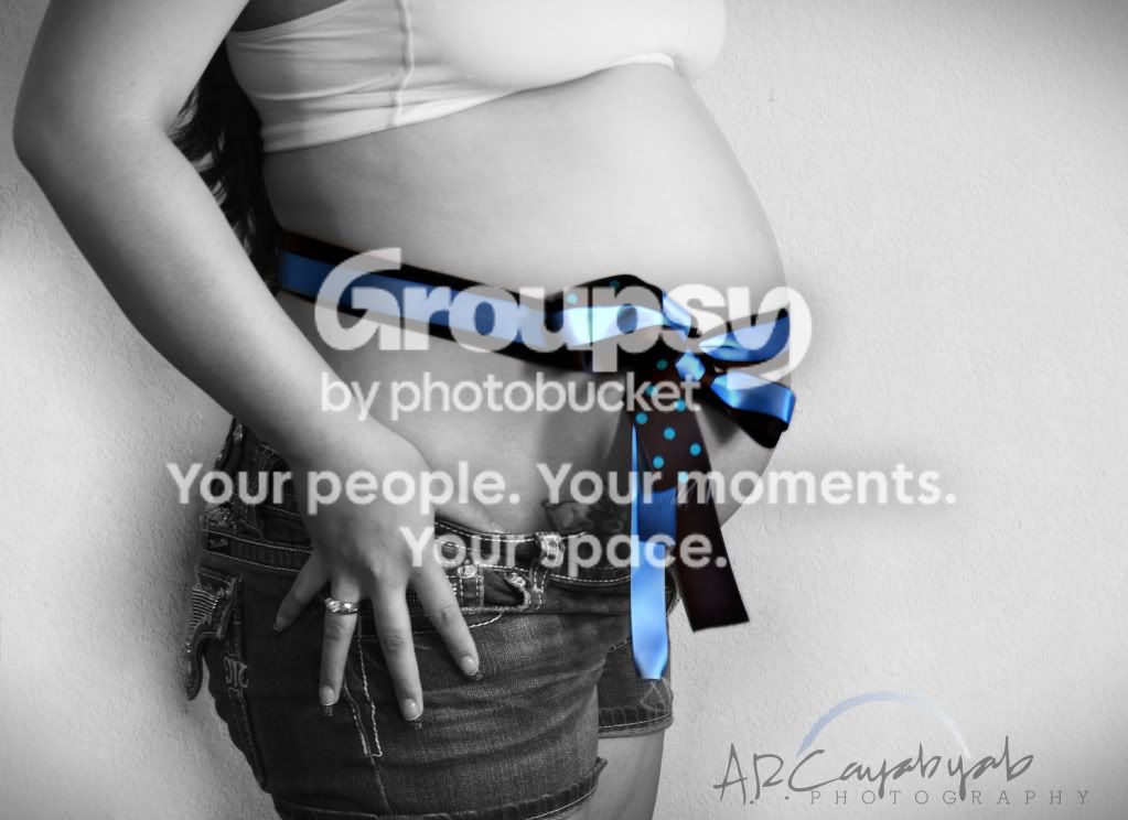
5. Again, you've lost almost all detail in the shirt. Always discuss clothing choices with clients. Whites and blacks are best avoided whenever possible, and alway, always, ALWAYS, make sure that they don't wear something that contrasts so strongly with something else (dark blue denim shorts, white shirt).
Just my $00.02 worth - your mileage may vary.
~John