What's new

First modelling shoot

Starskream666

No longer a newbie, moving up!
Joined
Jul 6, 2011
Messages
598
Reaction score
56
Location
England, West Yorkshire
Can others edit my Photos
Photos NOT OK to edit
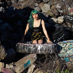
A friend adds designs to shorts and asked me to take some photos for her website. She wanted them to look erm sort of instagrammy vintage-esque (i know) so on the edits I added some yellow hear and there and things to warm up some shots. Here are the ones i think personally are the best. When looking back at them I realised I should of used a reflector because there were some hard shadows on the face, but this was my first time so I overlooked that.


if the shorts are the subject get closer on them
 
I dunno, I took seperate pics of just the shorts aswell for sales, so I thought that was close enough. I know what you're getting at though
 
Most of these shots are completely blown and the WB is all over the place.

Not thrilled.
 
the backgrounds are way too bright, and by the way the pictures are taken i would never think that they are an ad for shorts, im more apt to think that its just a regular outdoor model shoot
 
Most of these shots are completely blown and the WB is all over the place.

Not thrilled.

But dude, these shorts are for chicks of the MODEL's age and demographic!!! You would look TERRIBLE in these kinda' shorts!
 
I don't mind that the highlights are blown and they're kind of yellow (well, a lot of them -- you have a couple different styles going on here, but let's stick with the "high key/yellow" ones). It's a nice warm look, no problem.

She's a lovely girl.

You're not close enough to her, I think, too much space above her head frequently -- you're wasting space you could be filling up with pretty girl. Also there's something flat about them. Did you just throw a translucent yellow layer over the whole thing? It looks.. kind of, but not entirely like that's what you did. More contrast in the higher-mid-tones I am thinking, to punch up the clothes a bit.

And do try to get a more consistent look, or maybe two consistent looks. You're almost there, but every photo looks a little different, try to pull them together into clearer stylistic groups in post, I think.
 
Thanks for the constructive crit, Amolitor. Aye the last one looks very flat, the original tree next to her was just way too dark and i dunno wasn't how I wanted it, its not now either aha but yes for that one pic i actually did throw a yellow layer over it.

People on here see something like blown out backgrounds and think automatically they are bad and make the photo wrong, probably read it in a book or on this forum. But in this case I liked them, the one against the tree and on the wall particularly. Its the blown part that I like about those two.
 

Create an account or login to comment

You must be a member in order to leave a comment

Create account

Create an account on our community. It's easy!

Log in

Already have an account? Log in here.

Back
Top Bottom