First Photos for C&C- A Fresh Baby

chickpea

TPF Noob!
Joined
May 5, 2011
Messages
13
Reaction score
0
Location
BC Canada
Can others edit my Photos
Photos OK to edit
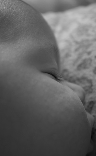
Hello, Looking for c&c on photos of a baby. I was trying to capture some alternate angles instead of the traditional straight up shots. Please c&c for focusing/light and theme. I only have iPhoto for editing so far, I have 'softened' the edges of the photos a little. Please be constructive! Thanks for your time!
8201105047_014310a9d6.jpg


2.
8200826120_36ec679099.jpg


3.
8199734359_7674def843.jpg


8200986315_079e0acb39.jpg


These appear overexposed to me. :popcorn:
 
Backgrounds are blown, but the little red 'X' appears sharp and well exposed!

;)

OP... no images showing, looks like you may have messed up your URL.
 
I'm not the best person to comment on composition on infants, but I will say that your monochrome conversions are rather muddy and mid-tone rich. Try increasing the contrast at least slightly.
 
I love how the title is "...a fresh baby"

lololololololololololololol
 
I like 'em. The closeups of body parts are all pretty good and interesting.

I especially like the little hand, with the little spot of light on it. Nicely done. The eye is also rather lovely, almost an abstract.

The "portrait" (DSC_0095) is pretty blah, though.

Don't mind the mid-tone rich look at all. We see too damn much massively contrasty stuff these days anyways. Babies are soft and gentle, I see no reason that a tonal range with the same properties should be applied. Visual drama is unnecessary, and even undesireable, here. The sense of light, however, is a little schizophrenic. Is it dimly lit, or not? I can't quite tell. I would push the tones collectively either UP or DOWN a bit (a light hand on a "brightness" slider, for instance) to resolve this a little.

yah, that focus and color crap is just boring.
give me more of that flat, boring but stylish stuff.
 
are we talking about these?
1
8201105047_014310a9d6.jpg

2
8200986315_079e0acb39.jpg

3
8200986315_079e0acb39.jpg

4
8199734359_7674def843.jpg

5
8200826120_36ec679099.jpg


You did a great job with making sure you got those sweet little details with your shots.

I had to see your settings when I copied these. Your images are out of focus from motion blur. Your shutters range from 1/40 to 1/60 which is wayyyy to slow to hand hold, let alone if the subject is alive and might move. At minimum these should have been shot at 1/125. You were at ISO 200. That could have been raised significantly and still been in a safe area for these. They'd have then been in focus.

Your black and white conversions are incredibly flat and grayscale. The flat might be OK if they were properly exposed, but they are under by about a full stop or more.

Is your monitor calibrated? I have a feeling you see these much brighter than they really are. And probably with much more contrast as well.
 
Thank you for your reply! Great input, I definitely should have used a faster shutter speed. As a newbie, I'm certainly guilty of not checking the ISO as well.
And am I correct: If I open the aperture more, I would gain better contrast for black and white conversion?
I will check my monitor settings too
 
MLeek, how did you get the photos on the thread? I've followed the tutorial posted by Corry in 2007 and they show up only to be little "?" when i actually post???
 
MLeek, how did you get the photos on the thread? I've followed the tutorial posted by Corry in 2007 and they show up only to be little "?" when i actually post???

No, what caused the low contrast is the underexposure.
The entire shot is in the shadows sort of and you can't increase the contrast much without showing a lot of grain.

Concentrate on getting shots that are well exposed and then you can do a lot with them in post-processing.
 
I dunno if they're under or over exposed. I do know that a "contrast" slider has been used to flatten the contrast down, which has squashed the tones rather brutally into the center. I hate myself for looking at the histograms, but I am not seeing any of the characteristic spikes at the top or the bottom that often go with under or over exposure, so I suspect these are "properly exposed" images which have had simple adjustments applied.

These might be a little more appealing visually if you had used a curves tool of some sort, depending on the software you use for editing, to get the soft middle-tone-heavy look you're going for here, rather than simply sliding the contrast slider down. Use of a curve tool is outside the scope of this post, but once you get the hang of them they're pretty nice.
 

Most reactions

Back
Top