What's new

First Photos Posted - C & C Please

cwcaesar

TPF Noob!
Joined
Nov 26, 2012
Messages
307
Reaction score
52
Location
Middle Tennessee
Can others edit my Photos
Photos OK to edit
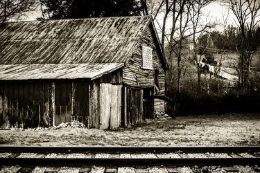
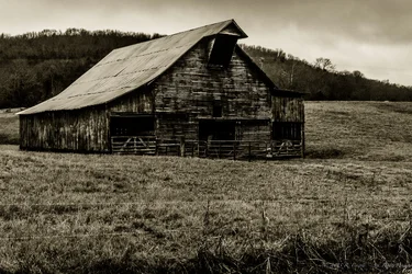
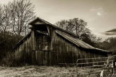
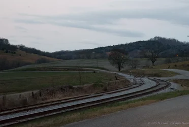
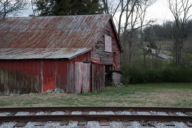
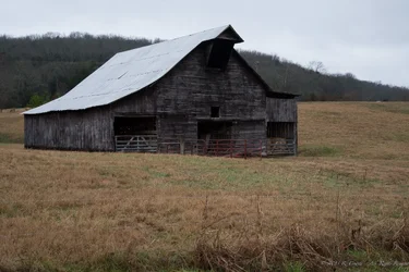
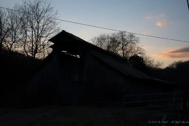
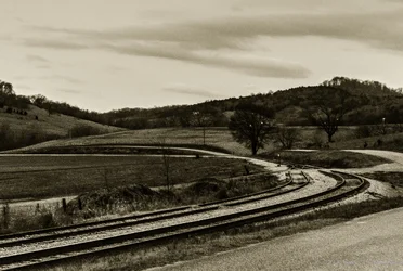
I have been hanging around a couple months now and I figure it is time that I post a couple of my own pics. The 4 that I am posting below are going to be framed at 11 x 14, matted to 16 x 20 in my office at work. They have all had just about the same post processing done to them so that they will match on the wall, so that is the reason for that. I chose the sepia tone because I thought it went well with the old barns. Let me know what you think.

1
$DSC_0045-2.webp

2
$DSC_0046-2.webp

3
$DSC_0737-2.webp

4
$DSC_0829-2.webp
 
I like the sepia, great addition. My favorites are 2 and 3. 2 I love for the story it's telling, I think the train tracks really make it and the drooping of the barn is really nice. The angle of the shot and the contrast with the hard lines of the tracks accentuate it. 3 I like for the composition and simplicity. 4 is nice, but I prefer the others. 1 could be interesting with the line of the tracks but it gets jumbled up. It's not simple or clear enough. Nothing holding my interest.

They're all a little dark, a little contrasty, and not as tack sharp as I'd ideally want them, but that may be the effect that's giving them the feel they have. My 2 cents. Thanks for sharing, and keep it up! Very enjoyable work.
 
They all look a little underexposed, but maybe that is the "shrinking and conversion" for posting, or the sepia conversion - don't know. I think it is a little difficult to try and comment on an image this small, when you are going to display them at 11x14. Even the "larger" images which I can see here are probably still not good enough compared to the 11x14. First impressions though -

#1) There is very little tonal range here. The features on the land area, grass, trees, etc. blend together, but maybe that is the sepia conversion - I suspect it is.
#2) Not bad, a little too cluttered for me, but if you like it, that is what counts.
#3) I like the 3rd one the best. It would be interesting to see the originals for comparison, or even a black and white conversion instead of the sepia.
#4) I think that this one would be better without the fence - it is distracting for me and looks too modern to be paired with the old barn.

MY 0.02¢ FWIW.

WesternGuy
 
Thanks for the comments! #3 is my favorite as well. 1-3 were all taken from the window of my truck, either on my way to or from work. #4 I actualy got out of the truck and took the photo from the fence where the gate is. I am sure that the sharpness could be greatly improved if I were to use a tripod. The dark, contrasty feel is really what I was going for in these. I believe they were all shot at ISO 6400, and I couldn't really get a decent image in color in post, so these were candidates for the sepia treatment right out of the camera. Well, at least that is the case with #1. I liked the result so I duplicated the process (in camera & post) so I would have a matching set.

Exposure may be a bit dark on these. I processed the images on the MacBook Air laptop in lightroom, and I don't have a calibrated screen to view them on; so you may be right. I just can't tell with the equipment I have.

#1 was probably the first landscape picture that I took that I liked, back when I first got a DSLR. It was the first image that I spent much time on in Lightroom (removing powerlines takes me forever; I also removed a power line from #4). Probably not my favorite image now, but I still like it. Maybe because I drive past there every day on the way to work.

Again, thanks for the C&C. More is welcome if you have any to offer. I will try to post the original images tonight.
 
What time of day did you take the photos?
 
The first doesn't do anything for me. It has a leading line, but it doesn't really go anywhere except out of the frame on the left.

The barns are pretty good as far as composition (although I'd rather see more barn and less background in 2) and the sepia works well for this. However, they are overly contrasty. There are both highlight and shadow areas with no detail. Have you printed these? If the full-size files look like this, you could lose even more detail printing because very subtle highlight and shadow details are difficult to print well.
 
No, these have not been printed yet. I am not sure what paper to print these on. Any suggestions? Matte? Glossy? Metallic?

Ken, you think I should bring up the shadows before printing?
 
cwcaesar said:
1 and 2 were before sunrise. 3 and 4 were after sunset.

I think you'd find that you probably didn't need ISO6400. Unless it was unnaturally dark, and you had no tripod.
 
cwcaesar said:
1 and 2 were before sunrise. 3 and 4 were after sunset.

I think you'd find that you probably didn't need ISO6400. Unless it was unnaturally dark, and you had no tripod.

No Tripod used, and it was overcast in 1, 3, and maybe 2; but I don't remember on that one for sure. 4 was clear, but the sun was going down fast. I exposed for the sky and tried to keep the shutter speed high to reduce camera shake. The foreground was completely black in the original photo. I was actually surprised to get this much detail out of it.
 
I'll go along with Ken on this. I particularly like #2, but you sucked all the midtones out of it. I'm not sure about the sepia treatment. I'd like to see a good straight B&W first.
 
No, these have not been printed yet. I am not sure what paper to print these on. Any suggestions? Matte? Glossy? Metallic?

Ken, you think I should bring up the shadows before printing?

I usually favor Matte paper, but it's really a matter of taste. I don't think high gloss or metallic would work well for these. I'd stick to Matte or Semi-Gloss (satin, pearl, etc.). What you really need is test prints. If you are planning to frame them, you should go to a custom lab, which should be willing to make a few small test prints for a nominal fee. Before even doing that, yes, I'd bring up the shadows and also back off on the highlights.
 
I'm not convinced that you're going to be very happy with any of these at 11x14. That's not a small print, and these photos are all pretty soft when you start looking closely. The blacks are pretty consistently flat. In #4 the group of trees more or less in the middle has some seriously nasty looking halos or something going on at the top of the trees. Too much tonemapping or sharpening applied, I think.

All these things have the potential to bug you at a large size.

As compositions they're workmanlike representations of interesting things, and as such, they're fine. A little cluttered for my taste, and #3 seems to have far too much foreground for my taste. These are quibbles about personal taste, though, if you like them, great.

That said, these are pretty appealing as decor. They have a pretty consistent "look" (with the exception of #2 -- either flatten it out, or hang it in the darkest of your 4 locations, it "pops" quite a bit more than the others) so should hang together on the wall pretty well, and nobody else is going to notice the problems (mostly because people don't *look* at wall art, they note that it's there and nod wisely).
 
I like contrast on B&W's. This would be my edit of my choice.
 
Last edited:

Create an account or login to comment

You must be a member in order to leave a comment

Create account

Create an account on our community. It's easy!

Log in

Already have an account? Log in here.

New Topics

Back
Top Bottom