What's new

First Photos Posted - C & C Please

cwcaesar said:
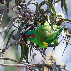
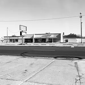
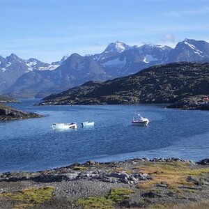
1 and 2 were before sunrise. 3 and 4 were after sunset.

I think you'd find that you probably didn't need ISO6400. Unless it was unnaturally dark, and you had no tripod.

I checked again: 1 & 2 were shot at 6400, 3 was at 3200, and 4 was at 1600.

Rick, I do like the B&W as well, but I have brown (almost rosewood) frames with cream matts. I thought that the sepia would work well with this hardware.

Molitor, the 'halo' that you see is probably my attempt at removing the power line from the image. I added very little sharpening to these; and I am unsure what 'tonemapping' is.

I do agree that these are not 'the best' photos out there, and at 11x14 I am probably pushing the limits given their lack of sharpness; but I have grown weary of people informing me that I need something on the large blank wall in my office. These are just 'for now' and I will replace the prints as I capture better images.
 
To be honest, I thought it was some sort of pixilated lettering. I'll have to look at it again.
 
No lettering, just a quilt pattern. It was actually what first caught my eye on this barn. Having the train tracks in the foreground was just an added bonus. :)
 
View attachment 33573

Here's one with the sign. My version looks like a freshly painted piece of plywood (sucks),
but I can't seem to define the quilt pattern. The other thing was the sky, or lack of. I tried to
simulate some dark clouds just to break up the bland gray.
All in all, the sign is an improvement. It's just ashame the checkering wasn't larger.
 
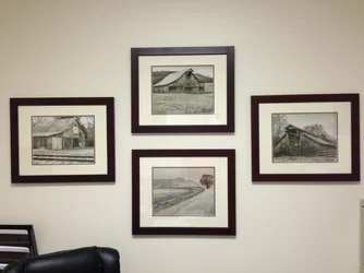
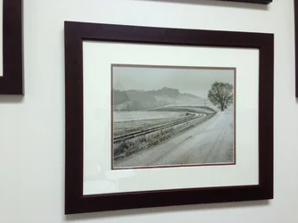
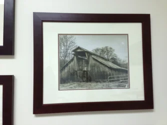
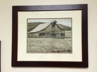
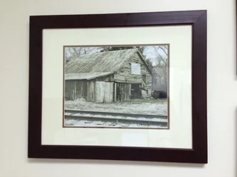
Okay, After taking your cinsiderations to heart, I re-processed the pictures and used FAR less contrast, which brought back the mid tones in these. I actually only used pics 3 & 4. #1 had too much camera shake, and I just couldn't get #2 to look right. I used a photo that I took from only a few feet away, so there is a different angle on the barn. #1 I used a similar image from about 100 feet up the road, but I included a tree in the image to add some more interest. I kept the sepia feel to them and printed them to 11x14, matted, and framed them. Here is the final result now hanging in my office; just a couple quick snaps from my iphone. Thanks for all the help and opinions!!!

$photo1.webp

$photo3.webp

$photo4.webp

$photo5.webp

$photo2.webp
 
I like # 2 I like it both in B&W and in color
Don't care much for the other ones, not sure why but to me they seem to be lacking something.

I like Rick's edit, it makes the main subject pop out.

That second picture above is nice, love the curve in the road.
 

Create an account or login to comment

You must be a member in order to leave a comment

Create account

Create an account on our community. It's easy!

Log in

Already have an account? Log in here.

Back
Top Bottom